Pull the trigger with confidence.We look deeper into market trends. Our analysis puts our readers ahead of price movements... and ahead of the public. For over 40 years, institutional investors and individual traders have relied on our forecasts. Get the edge you've been missing. |
|
Cattle Prices Have Outrun Grain Prices

Most of the time, corn prices move in step with the futures prices for live cattle. This makes some sense from a meteorological standpoint, as better growing conditions for corn also mean better conditions for grasses (hay), and so cattle ranchers can produce cattle more economically. There is a bit of a lag sometimes, since cattle ranchers cannot immediately ramp up production of more cattle when grain prices and other inputs fall. Biology dictates that it requires a certain amount of... Read More
Inflation Rising Right On Schedule

It makes a lot of people uncomfortable when I talk about the interrelationships between climate data and economic data. This is not how people were taught to think in their college economics classes, about how the economy supposedly works, and so it must be some kind of voodoo. But irrespective of how people feel about such information, there is a lot we can learn from it.
We are now seeing signs of inflation turning higher, not just in the CPI numbers but also in the Fed's favorite... Read More
Total Number of Stocks Is Shrinking

The major averages may still be trending higher, but the total numbers of issues traded on the NYSE and Nasdaq peaked back in January 2022 and have been declining since then. This is not a bullish sign for the financial markets.
The Nasdaq market has looser listing standards than the NYSE, and so it attracts a larger number of total listings. But ease of doing an IPO on the Nasdaq sometimes means marginal companies which should not come public do so anyway, and then struggle afterward. ... Read More
Doctor Copper Has A Message On Inflation

One trite Wall Street saying is that copper is the only metal with a PhD in economics. This is because copper is an industrial metal, the demand for which waxes and wanes with economic growth and shrinkage. So falling copper prices can be a sign that economic trouble lies ahead, and the converse is also true.
I would argue that copper's more reliable role is as a leading indicator of inflation, as illustrated in this week's chart. It shows the price of copper, shifted forward by 2 months... Read More
Bitcoin Matching Gold’s Footsteps

Last September, I wrote here about how there has been a change in what Bitcoin is and how it behaves. Bitcoin prices are now walking in the footsteps of gold, and have been since about April 2022. I should emphasize here that the magnitudes of the price movements in each market do not match. It is all about the direction of movement and the timing of the turns. But I figure that in any market, if I get the direction and timing right, then the magnitudes can take care of themselves.
The... Read More
More Food Inflation Is Coming

Inflation numbers of all sorts have calmed down since the wild days of Covid shutdowns messing up the supply chains. But inflation numbers for at least the food category are about to see another surge upward.
That is the message of this week's chart, which shows how the movements of gold prices tend to get echoed about a year later in the prices of wheat futures. This principle also works for corn prices (not shown). Because grains are an important input into lots of finished products... Read More
Election Years Are Different

We are now firmly into this election year, with both major parties' candidates determined. This moment is pretty early for that type of resolution. It has also been more than a century since a former president served as a major party's candidate seeking reelection (and no, Teddy Roosevelt's Bull Moose Party run in 1912 does not count).
Most of the time, election years are up years for the stock market. But there are big differences during the year depending on whether there is an... Read More
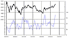
Quiet McClellan Oscillator

Since late January 2024, the daily readings of the NYSE's McClellan A-D Oscillator have been contained in a very tight range. They have also been showing us only "simple" structures, which carries and interesting message.
A "complex" structure in the McClellan Oscillator (and in some other indicators too) is one that sees chopping up and down while on one side of the zero neutral level. The message of a complex structure is that the side on which it forms is the side that is "in charge". ... Read More

Download Latest Reports
(Subscription Required)
The McClellan Oscillator
 Created 1969, the McClellan Oscillator is recognized by technical analysts as the essential tool for measuring acceleration in the stock market. Using advance-decline statistics, it gives overbought and oversold indications, divergences, and measurements of the power of a move.
Free Chart In Focus Email
Our Work in the News
Latest Articles
 The McClellan Oscillator & Summation Index
- Useful Analysis Links
- The Intersection of Stock Market & Political Races
- Fox Business Appearance
- Tom on CNBC
- 20 Years Publishing This Newsletter
- Tom on Apple’s Massive Market Cap
- Hindenburg Omen Chart for Dec. 4 CNBC Interview
- Could market see September selloff?
- Tom’s Fed Balance Sheet Chart on CNBC