After The Fall, Revisiting Apple and RCA
Free Chart In Focus email
Delivered to you every week
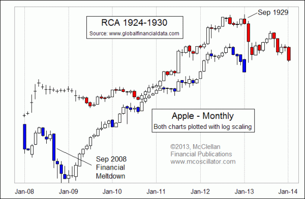
Back on September 26, 2012, we published a chart in our twice monthly McClellan Market Report newsletter comparing the price pattern in Apple Corp (Nasdaq: AAPL) to that of RCA from the 1920s and 1930s. I had taken a chart previously published by Global Financial Data of RCA's price behavior, and graphically overlaid a chart of Apple's recent price action, being careful to equalize time spans. The point of the comparison was that Apple's price behavior during its big advance over the past 3 years looked an awful lot like the pattern RCA had shown during its own big advance in the 1920s. The implication was that the topping behavior of that tech darling from years ago might be playing itself out again in the pattern of Apple's price behavior.
I updated that chart in my Nov. 8, 2012 Chart In Focus article, which is linked below, after Apple's initial decline seemed to have validated the chart pattern analog, at least up through that date. I subsequently attained the raw monthly data for RCA with the help of the nice folks at Global Financial Data, which allowed me to create the chart above. It has been featured in the pages of our twice monthly newsletter, and it appears to be continuing to work even now. They were also the subject of a Dec. 12, 2012 interview I did on CNBC.
Apple's earnings disappointment for Q4 has sent its share price plunging on January 24, 2013, and that sharp drop is exactly in keeping with what RCA's price pattern said should be happening now.
It is fascinating to watch the commentary about Apple in the financial media. Fundamental analysts are lowering their earnings outlooks and price targets. TV news anchors are asking whether Apple as a company has finally run out of mojo 15 months after Steve Jobs passed away. And all of this bearish talk about Apple is arising at a time when RCA's price pattern suggests that Apple should be nearing a meaningful bottom.
Following its drop in the 1929 crash, RCA actually saw a multi-month rebound effort in 1930. That rebound eventually rolled over, taking RCA's share price down to much lower levels during the early 1930s, but the rebound in early 1930 was an impressive one while it was going on. Given Apple's price pattern resemblance to RCA's behavior thus far, it would not be too surprising to see a similar bounce in Apple in the months ahead, especially given how bearish so many investors seem to be turning lately about Apple's stock.
In a similar vein, Apple's price pattern also shows a nice resemblance to another tech darling from the past, as shown in this next chart which has also been featured in our newsletter as well as our Daily Edition:
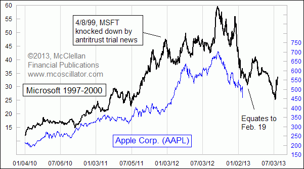
Microsoft's share price during the run up to the 2000 top of the Internet bubble looks an awful lot like Apple's price behavior since 2010. One big exception to the pattern correlation is noted in the chart. MSFT got knocked off track in April 1999 when the Justice Department's antitrust action against the company brought some bad news for the share price. Following that dip, MSFT got back on track and continued higher. Apple's share price skipped making a similar dip at that point on the chart, although the other landmarks on MSFT's price pattern did see equivalent behavior in AAPL's price plot.
If Apple's share price continues to follow the path set down by MSFT in 2000, then we can expect a continued decline toward a bottom ideally due Feb. 19. But before you go counting your chickens about that coming true, remember that all price pattern analogs that I have ever studied have broken correlation eventually. And they seem to have a habit of breaking correlation right at the moment when one is counting on them most to keep going (how do they know?). Some kind of break in correlation is almost assured, since the RCA and MSFT patterns seem to disagree about what happens after that initial bounce from AAPL's presumptive February 19 low.
Remember also that in all of this analysis, I am just comparing the stocks' price patterns, which are statements about the behavior of investors. I would never make the statement that Apple the company is the same as Microsoft or RCA. They are very different from each other in real ways. But from the viewpoints of investors in each era, each of these companies was seen as the tech darling of its time, and so investors seem to have responded in similar and predictable ways in each case in terms of the share price behavior.
Tom McClellan
Editor, The McClellan Market Report
Nov 08, 2012
Apple Walking In RCA’s Footsteps |
Oct 12, 2012
40-year Cycle In DJIA |
Aug 06, 2010
Correlations May Not Be What They Seem |