Tracking the VIX’s Response To Price Moves
Free Chart In Focus email
Delivered to you every week
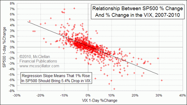
It is no big secret that the CBOE Volatility Index (VIX) moves in response to changes in stock prices. The VIX actually has a strong inverse correlation to the SP500, with a correlation coefficient of -0.75. That means that most of the VIX's movements can be explained by the movement of the SP500, but there is some interesting information in those remaining 0.25 points of non-correlation that we can exploit.
This week's chart compares the daily change in the VIX to the daily change in the SP500 on what chartists call a "scatter plot". Each tick mark represents 1 day's pair of numbers for what the VIX and the SP500 do. There is a generally linear relationship, especially for values closer to zero. The further out on the chart you go into the realm of extreme daily changes, the looser that relationship becomes.
If every tick mark were to fall exactly on the regression line, then that would mean that changes in the VIX were perfectly correlated to changes in the SP500. If that were the case, there would not be any use in ever looking at the VIX, because it would just be a reflection of the behavior of the SP500. The real insights come when two normally correlated data series do something different from each other. That is where the useful information lies.
To get at that useful information, we can calculate what the VIX's percentage change should be for any given change in the SP500, and then find the difference between that theoretical change and the actual change. This is the math involved in this cumulative chart:
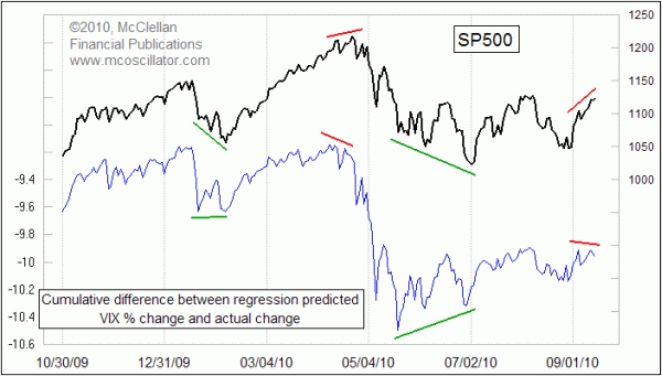
Most of the time, the daily cumulative regression prediction line does pretty much what the SP500 does. That is to be expected, given the strong correlation between the SP500 and the VIX. But when the two do something different, then there is a story to tell.
In April 2010, the SP500 was making a higher price high, while this regression prediction line was merely equaling the level of its January 2010 high. And it made a divergent lower high relative to the SP500 behavior, which said that options traders were starting to feel itchy about the market at that top.
We are seeing the same sort of divergence right now (September 2010). Whether or not it turns out to be as significant as the divergence at the April 2010 top remains to be seen, and is something that we will be covering for readers of our Daily Edition and our twice monthly McClellan Market Report.
Tom McClellan
Editor, The McClellan Market Report
Sep 10, 2010
Year-End VIX Plunge Coming |
Feb 05, 2010
The Volatility of Volatility |
Oct 02, 2009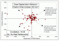
September Does Not Control October |