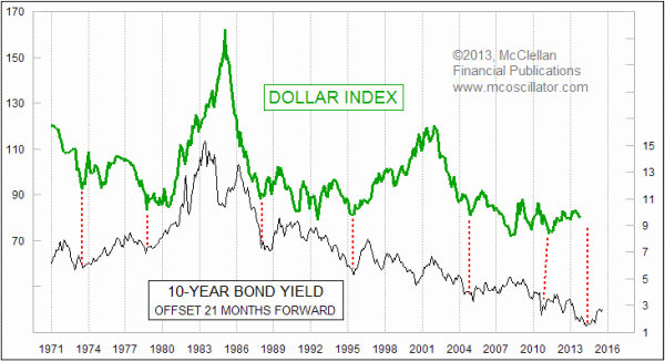
Bond Yields Say More Downside For Dollar
Free Chart In Focus email
Delivered to you every week
It should not be surprising that there is a relationship between interest rates and the value of the dollar. What may be surprising is precisely how long it takes for movements in interest rates to actually show up in the dollar.
This week's chart looks all the way back to the beginning of the data for the U.S. Dollar Index back in 1971. A comparison is made to the 10-year T-Note yield, and the key insight is that shifting bond yields forward by 21 months yields a much better pattern fit.
It is not a perfect fit. Try to imagine something that happened 21 months ago having a precise effect on your life, and you can then see how improbably it would be that any piece of data from 21 months ago should have anything more than a random effect on the value of the dollar, or really anything. But we can nevertheless see that the up and down movements do seem to match up, albeit problematically, but the correlation is still there.
The 10-year T-Note yield bottomed in the month of May 2012 at 1.58%. Adding 21 months to that date equals February 2014 for an ideal bottom for the Dollar Index. But a cursory look at the correlation in the chart shows that such correlation is only approximate, and so no one should chisel his trading instructions into stone and send them by camel caravan to his broker for February 2014. It is sadly just not precise enough for such usage; it would be so much more fun if the world really did work that precisely.
The point for us to take from this for now is that this relationship still calls for more downside movement for the Dollar Index from here, and then an upturn in 2014 to match the small upturn we have already seen in the 10-year yield. But when considering the timing of that upturn, we should take into account the huge degree of variability in this pattern correlation. And the larger point is that we cannot reasonably expect a major uptrend in the Dollar Index until AFTER bond yields have been allowed to rise again, and then also AFTER the 21 month lag period goes by.
Tom McClellan
Editor, The McClellan Market Report
Aug 29, 2013
Gold Says Wheat Prices To Drop |
Jun 26, 2013
Gold is Following in Stock Market’s 2009 Footsteps |
Dec 20, 2012
Steep Yield Curve Does Not Offer Complete Immunity |