Fed Still Behind The Power Curve

Free Chart In Focus email
Delivered to you every week
The “power curve” is a term borrowed from the jet age of aviation, referring to the delayed response time of a jet engine to an increase in the throttle position. In 1979, New York Yankees catcher Thurmon Munson tragically died while piloting a Cessna Citation jet, sinking too low while on approach for a landing. He had reportedly realized there was a problem and added throttle, but the lag time in the response of the jet engines meant that power was not there soon enough to correct the flight path. Munson’s one year of experience in piston-powered aircraft, which have a faster throttle response time, was cited as a factor in the pilot-error crash that killed him.
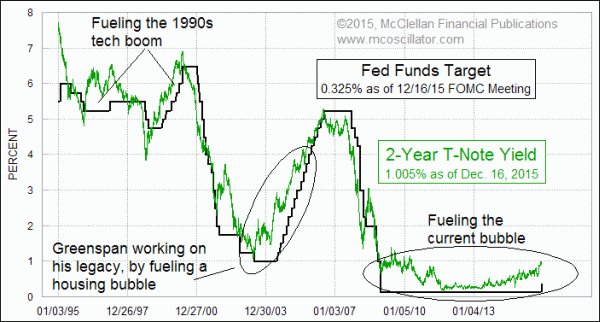
The stock market and the economy have a similar lag time in response to throttle adjustments by the Fed. And it is the 2-year T-Note yield which tells us what the throttle setting ought to be for shorter term rates.
Two years ago, the 2-year T-Note yield was hovering around 0.30%, and so having a target Fed Funds rate of 0% to 0.25% was not that much of a problem. But just recently the 2-year T-Note yield has risen up to 1.00%, and the Fed has been asleep at the switch. This week’s chart shows that when the Fed is slow to respond to what the bond market is saying about where rates should be, it creates big problems for the financial markets. If the Fed keeps rates too low, it fuels a bubble of some kind. Keeping the Fed Funds target above the 2-year T-Note yield puts a braking force on the financial markets.
The Fed was slow to raise rates in the early 2000s, during Alan Greenspan’s final term as Fed Chairman. That delayed response helped to fuel the housing market bubble. And after Bernanke took over, the Fed was also slow to lower rates when the housing market collapse hit, worsening the damage as a result.
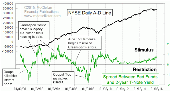
Now the Fed is making its standard mistake, waiting too long to start changing short term rates. They have at least now started that process, but they are still behind the power curve. This next chart looks at the spread between the 2-year T-Note yield and the Fed Funds target.

This most recent change in Fed policy only slightly mitigates the big spread that has been building. The Fed is arguably still being too stimulative, at least based on the message of the 2-year T-Note yield. When there is a positive spread, that is stimulative, and the NYSE’s A-D Line typically moves higher. A restrictive Fed takes the A-D Line and the major averages lower. But there are exceptions, such as in 2002 when the Fed’s stimulus was not enough to overcome the downdraft from the Internet bubble collapse. And in 2008, the Fed’s stimulus was not enough to overcome the downdraft of the real estate bubble.
Now we are in the downdraft of the energy bubble. Overly low rates helped to fuel the fracking boom, and bad government policies around the world overly fueled supposedly “green” energy projects. Those twin stimuli have led to seeing oil prices move down to the same level as the 2009 commodity crash bottom, and Germany already has summertime solar electricity prices at negative rates in the middle of the solar day. Those two factors are going to require a similarly lengthy period of readjustment.
In the midst of all this, the Fed still thinks that its actions matter in terms of determining how price inflation behaves. The data show that the Fed is powerless in this area, but that does not stop the FOMC from fiddling around with the financial market, and causing no end of trouble.
Tom McClellan
Editor, The McClellan Market Report
Jul 30, 2015
Debunking the Fed as the Controller of Inflation |
Feb 26, 2015
2-Year T-Note Shows Path For FOMC |
Sep 17, 2015
Misplaced Optimism on Housing |
Apr 16, 2015
US Taxes Returning to Economy-Killing Level |