Flight From High Yields Marks Stock Market Bottom
Free Chart In Focus email
Delivered to you every week
High yield bonds as an asset class often get lumped in with Treasury or high-grade corporate bonds. But high yield bonds as a group tend to behave much more like the stock market than like the bond market, while also throwing off attractive bond yields. As a result, high yield bond funds and ETFs tend to attract stock market investors who are looking to amplify their dividend yields, and they do not get the "flight to quality" effect seen in T-Bonds.
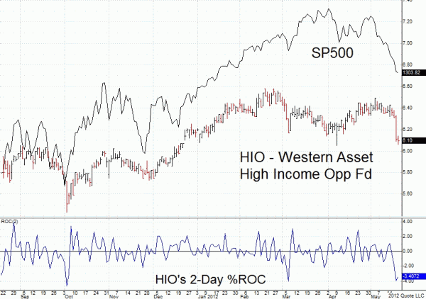
In addition to serving as an investment vehicle, high yield ETFs can also make for a great indicator of what is happening to the overall stock market. This week's chart compares the SP500 to HIO, which is a fairly representative example of high yield bond ETFs as a group.
Generally speaking, there is a really good correlation between the SP500 and HIO, as is the case with most high yield bond funds. But the really interesting behavior that HIO shows is how its investors tend to panic out at useful times.
The lower indicator in this chart is a 2-day percentage rate of change for HIO. It just measures how much price change has occurred since two days before. When we see a drop of greater than 2% over a two day period, that is usually a great sign of a short term bottom for the overall stock market. The market's slide in May 2012 was not being fully reflected in a response by HIO's share price until just the last couple of days. The yield hungry investors really were not participating in the selling behavior until the very end.
That's the useful indication that we can take from watching high yield bonds. If the market is declining but high yield bonds are hanging in there, then the decline may not be done. Once we get to the point where these investors are finally feeling the pain and bailing out, then the end of the decline is at hand.
Perhaps just as interesting is that when HIO moves upward by 2% or more in two days, it does not have the same meaning that such a down move has. More often, a 2% up move occurs at the beginning of a rally for stock prices, whereas a 2% down move marks the end of a decline. So up and down are not the same.
One other way I like to look at high yield bonds is to watch MHCAX, which is a regular open ended mutual fund offered by MainStay Funds. I like to use the NAV of this mutual fund as an indicator because it has a long history to observe, and because it is generally well behaved. I prefer to watch it on a weekly basis, because that helps to filter out the effects of their regular distributions.
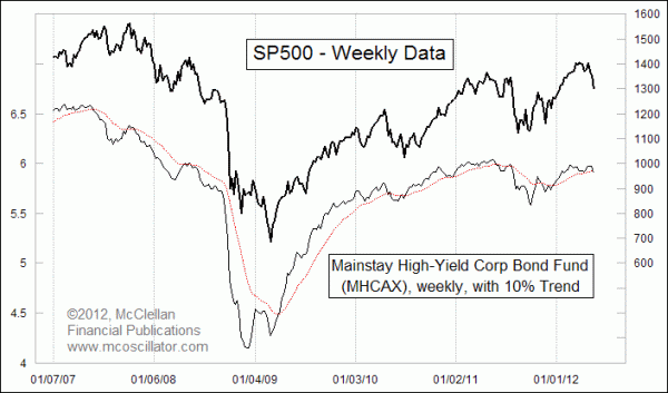
When MHCAX is above its weekly 10% Trend (19-bar EMA), that is generally a good condition for the stock market. But when MHCAX drops below that moving average, it signals liquidity problems for the overall market that can be a problem for stocks. It correctly told of the problems in the 2007-09 bear market, and also correctly signaled the return of strong liquidity just after the bottom in March 2009. It has stayed mostly above its moving average, except for the episode in 2011 when it correctly warned of the problems that led to a big decline for the stock market in July and August 2011.
Tom McClellan
Editor, The McClellan Market Report
Mar 02, 2012
DJIA At Higher Highs with Negative McClellan Oscillator |
Nov 11, 2011
Borrowing An Indicator |
Dec 09, 2011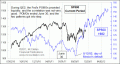
What Debt Default Means For The Stock Market |
Oct 08, 2010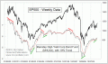
Strength in Hi-Yield Bonds is Bullish For Stocks |