Golf Balls, Geese, and the VIX
Free Chart In Focus email
Delivered to you every week
No, it is not a mistake. Our chart this week really is a diagram of a golf ball.
I was speaking this week with my friend and fellow technical analyst, Greg Morris, who has written two of the best books about technical analysis, on candlestick charting and breadth indicators. Greg studied aerospace engineering at the University of Texas, and went on to fly jets in the Navy and elsewhere. I studied aerospace engineering at West Point, and went onto fly helicopters in the Army. So we have a lot in common, and also like to kid each other in an inter-service kind of way.
Greg challenged me to try and incorporate more of my engineering training into my work as a technical analyst, so here goes. You'll have to stay with me; I promise I'll get to the stock market part eventually.
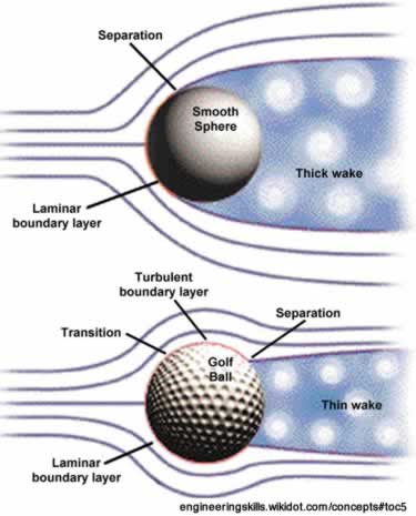
The diagram above compares a smooth sphere to a golf ball, in terms of the way that air moves around it. Almost everyone knows that golf balls have dimples to help them fly farther, but few people know why this works. The answer lies in an aerodynamic term known as the "boundary layer".
If an airfoil of any shape moves through the air, then the air molecules right next to the skin of the airfoil will be turbulent because the skin of the airfoil interacts with the air. Blow air across your forearm, and you'll feel that interaction. Farther away from the airfoil, the air flow is said to be "laminar", which comes from the same root word as laminate, and refers to the layers of the air that are depicted by the parallel lines in the diagram. Even a perfectly designed teardrop shaped airfoil pointed straight into the wind will still have turbulent flow right next to the skin, and that turbulent flow creates more friction or "drag". Aerodynamicists even talk about the "skin friction drag" of an airfoil.
The point which divides that turbulent layer of air next to the airfoil from the laminar flow all around it is called the "boundary layer" because it marks the boundary between turbulent airflow and laminar flow. If an airfoil in a wind tunnel is moved to a higher angle of attack versus the wind in the tunnel, then the boundary layer will move further away from the skin of the airfoil, creating more drag, and also more turbulence in the air behind the airfoil. The boundary layer separation point is a very important concept in aerodynamics, and much of aircraft design is devoted to manipulating that boundary layer separation point.
Dimples on a golf ball do an aerodynamic magic trick by causing that boundary layer to remain closer to the ball, decreasing that turbulent air and thus decreasing the aerodynamic drag on the golf ball. Less drag means that the ball can fly farther.
Now, how does all of this relate to the stock market? The comparison comes when we notice that during a sustained uptrend for stock prices, the "turbulence" of those prices tends to diminish. We normally use the term "volatility" to refer to stock market turbulence. During the course of an uptrend, the CBOE's Volatility Index (VIX) typically remains low, indicative of the lower volatility. Putting it into aerodynamic terms, one might say that during a calm uptrend, the stock market's liquidity flow is remaining mostly laminar, with diminished turbulence.
But after a stock market top, when stock prices start correcting downward, volatility tends to rise much like the increased turbulence in the air behind a flying golf ball. We see the effect of rising volatility in the VIX, which measures the implied volatility that is priced into SP500 options. When the VIX moves upward by enough, one might even say that it is signaling a switch from laminar liquidity flows in the market to turbulent ones.
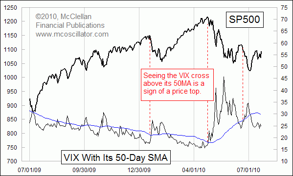
I depict this graphically with the 50-day simple moving average of the VIX. When the VIX is below that moving average, things are more calm in the market. Above that moving average, the market hits turbulence.
That is not to say that one cannot make money in a turbulent market. Geese take advantage of the turbulence coming off of the wings of the birds ahead of them when they fly in a V-formation, gaining extra lift so they don't have to work as hard. It is actually not true, as I was told as a child, that they all fly that way because the goose in front is the one with the map.
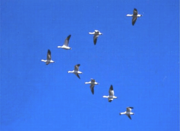
We can learn a lesson for trading from the way geese fly, seeking to get some extra lift for a portfolio at times by trading the turbulence during a downtrend. But one must understand that the game has changed for how to trade (fly) when the VIX is at a high level.
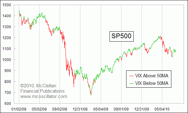
The chart below shows the effect on stock prices when the VIX moves above or below its 50-day moving average. The plot of the SP500 is painted red during times when the VIX is above the 50MA, and it is green during times when the VIX is below that moving average. They line up nicely with downtrends and uptrends for stock prices, albeit with a lag. One would need to add a few more rules to this simple measure to make an effective trading system, because there is a lot of the uptrend that gets missed as prices move up while the VIX is on its way down from a peak.
The point is that an aircraft, or a bird, can deal with turbulence, even with the turbulence that its own wings may cause. Traders can also deal with turbulence when they have an indicator (instrument) to tell them when to find it.
The final point might be that the excitement we all went through in May 2010, with the "Flash Crash", might be more accurately described as just the stock market going through a boundary layer separation event, which was signaled ahead of time by the VIX moving up through its 50-day moving average.
Tom McClellan
Editor, The McClellan Market Report
May 23, 2010
Spike up in VIX Was On Schedule |
Feb 05, 2010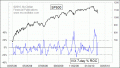
The Volatility of Volatility |
Jul 24, 2009
Bumpy vs Smooth |