Interest Rate Models Call For Lower Dollar
Free Chart In Focus email
Delivered to you every week
Most currency traders are already aware that the exchange rates are sensitive to the interest rates offered to depositors in each currency. But most are unaware of the long term lags between changes in interest rates in the U.S. and the resulting effect on the value of the dollar.
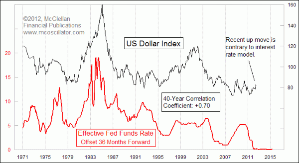
The chart above shows a comparison between the effective Fed Funds rate and the U.S. Dollar Index. The trick here is that the chart plot of the Fed Funds rate has been shifted forward by 3 years in order to get the two patterns to line up better. The implication is that the movements of the Fed Funds rate tend to be echoed 3 years later in the movements of the Dollar Index.
It is not a perfect correlation. Over the past 40 years, the correlation coefficient is +0.70, on a scale from -1.0 to +1.0, where +1.0 shows perfect positive correlation. A +0.70 reading is still strongly positive, but it does show us that the two plots do not agree perfectly.
Interestingly, the latest up move in the Dollar Index from its 2011 low was not part of the Fed Funds rate model. Such uncommanded movements have happened before, but the typical response is to see the Dollar Index realize it is off track and to work extra hard to get back to where it was supposed to be.
This next chart shows a slightly different view, but with a similar message about where the Dollar Index should go from here.
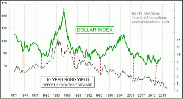
In this case, the 10-year Treasury yield is shifted forward as above, but only by a period of 21 months instead of 36 months. For whatever reason, the 21-month offset produces a better chart alignment of the up and down patterns in each plot. Because 10-year rates have been declining, the message is that the Dollar Index should head lower from here, for at least the next 21 months.
Now, here is the sticky point to this analysis. The long periods shown in these charts, over which the dollar's movements followed well what had taken place before with interest rates, were different from the current time in one important respect. Prior to 2008, it was arguable that interest rates were allowed to roam free, and thus were a semi-legitimate indication of the supply and demand in the credit markets. But since December 2008 the Federal Reserve has kept the Fed Funds rate effectively at zero, and has been working on artificially pushing down long term rates.
So we get into an interesting cause and effect argument when studying these charts. Do the lower rates themselves bring about the falling dollar? Or are lower rates indicative of some other underlying effect that is the real agent responsible for pulling the dollar down? If it is the latter, then the Fed's actions to artificially set interest rates lower than they would otherwise be may conceal the real message about where the dollar is headed.
In the May 5, 2008 issue of Forbes, economist Alexander Tabarrok said something material to this discussion: "A price increase is a message about scarcity. Price controls are like shooting the messenger."
Because the Fed has been fixing "prices" for how much it costs to borrow money short term, it may be disrupting the message for the Dollar Index contained in these charts. That is a significant risk factor to remember when we contemplate these lead-lag relationships.
Tom McClellan
Editor, The McClellan Market Report
Feb 19, 2010
Real Yields and the Dollar |
Jun 01, 2012
Full-On Panic Into T-Bonds |
Mar 04, 2011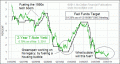
2-Year T-Note Should Guide The Fed |