Nasdaq A-D Line Does Not Work As Well
Free Chart In Focus email
Delivered to you every week
Over the years, people have asked why we focus so much on the NYSE Advance-Decline statistics, and not on the Nasdaq. They point to all of the NYSE issues that don't represent operating companies, things like closed end funds, rights, warrants, preferred stocks, and structure products, which supposedly contaminate the NYSE data. The Nasdaq is seen as a purer "stock" market, so its A-D data ought to be better, right? Well, not so much.
On its own, the Nasdaq's cumulative daily Advance-Decline (A-D) Line is just not as good of an indicator as the NYSE version. The reason is the longstanding negative bias which the Nasdaq A-D Line shows. That gets in the way of other messages which might come from the A-D data.
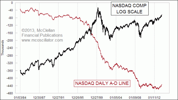
In fact, here is a stock market trivia question to amaze your friends with: When was the last time that the Nasdaq A-D Line made a new all-time high?
The answer is: NEVER. It started going downward from the beginning of the reporting of Nasdaq market data in 1971, and has never made it back to that start point.
Looking at the lead chart above, it is hard to find any times in the past 30 years when the Nasdaq's daily A-D Line was making higher highs. There are a couple you can find if you look hard enough, but they are very rare. Most of the time it is in the process of making lower highs. So if you see someone show a chart portraying a supposed bearish divergence between higher price highs in the Nasdaq Comp Index and lower highs for the Nasdaq A-D Line, you should understand that this is not necessarily a bearish condition. It is instead the normal background condition that is happening almost all of the time.
Even now, the 2013 level for the Nasdaq A-D Line is still below the tops it made in 2010 and 2011.
Part of the reason for this is that a lot of the lower grade public companies get listed on the Nasdaq, where they remain active for a while before getting delisted. If a company is going to IPO at $20/share and then go broke, it is more likely to do that on the Nasdaq board than on the NYSE. And every day that it spends going downward from that IPO price to delisting contributes to the Declines column.
The Nasdaq market has long been considered the "minor leagues" for listed companies, where easier listing standards made it possible for innovative new companies to come public. For a long time, it was seen as a mark of success for a company to graduate up to the "big board" and switch its listing to the NYSE. That has changed some in recent decades, as tech giants like Microsoft, Intel, and Oracle did not want to be seen as abandoning their innovative roots, and they were enticed to remain on the Nasdaq. For many years, the NYSE even kept open the single letter stock symbols M and I, hoping to lure Microsoft and Intel to come over and list with those. But they finally let them go to other companies.
Even during the go-go years of 1998-1999, when the Nasdaq Comp was zooming steeply upward toward its eventual bubble top just above 5000, the Nasdaq A-D Line was in one of its steepest declining phases. Most people remember that the Internet Bubble ended in 2000, but few people know that the foundations had been crumbling for a long time before then.
Here is a chart of total listed issues on the Nasdaq and NYSE:
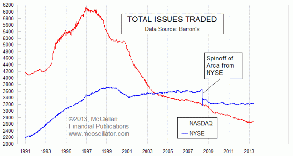
Total issues listed on the Nasdaq actually peaked way back in December 1996 at 6136 total issues. Now, that market's listings are down under 2600. Some of the big decline in the late 1990s came from small new tech companies getting gobbled up by bigger companies, but a lot of it was just a case of underfunded and overextended companies going broke and getting delisted. Remember Pets.com? How about Webvan.com?
One way to get around the bearish bias of the Nasdaq's A-D Line is to look at its daily Up-Down Volume Line, shown below.
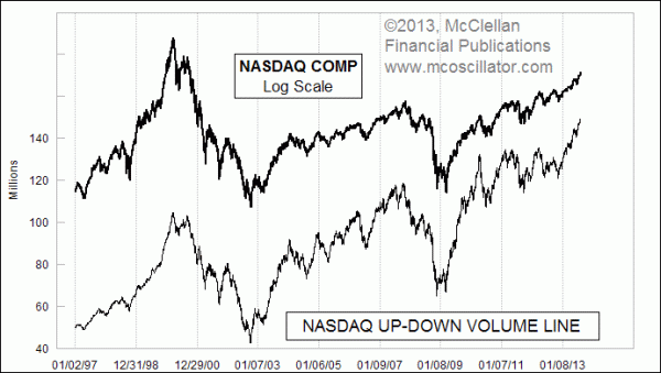
Because the smaller and more marginal companies on the Nasdaq don't trade as much share volume as the big companies, those small companies don't get an equal vote in the Up-Down Volume Line like they do in the A-D Line. So the Up-Down Volume Line gives a much better representation of what prices are doing.
And that's the problem. We almost never see any divergences between prices and the Nasdaq Up-Down Volume Line. The whole point of looking at an A-D Line or some other measure that is not a price index is that we want to get a different message than what prices are saying, but only at important times like major tops or bottoms. So looking at the Nasdaq's Up-Down Volume line does not help much because it almost never says anything different from prices. And looking at the Nasdaq A-D Line does not help much because it pretty much always says something different from prices, and not just at important turning points.
One of the topics that we have covered recently in our McClellan Market Report newsletter and our Daily Edition is the way that the NYSE's A-D Line is finally showing divergences relative to prices. And that message is getting amplified by seeing the Ratio-Adjusted Summation Index (RASI) turning down at the +500 level, which is a sign that the push to marginally higher price highs does not have liquidity behind it. There are really useful messages that one can take from market breadth data, when sophisticated indicators and proper interpretation are applied.
Tom McClellan
Editor, The McClellan Market Report
Aug 01, 2013
U.S. Nearly Alone In Making New Price Highs |
Nov 15, 2012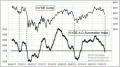
Summation Index’s Magic Tricks |
Apr 20, 2012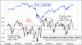
Summation Index Promises Higher Highs After Correction Ends |