NIRP Disrupting 60-Year Cycle
Free Chart In Focus email
Delivered to you every week
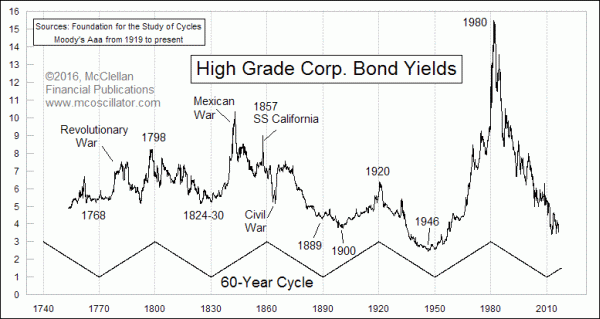
The 60-year cycle in interest rates has been operating for as long as interest rate data have reliably been collected. And right now it is saying that we should be in an upward trend for interest rates, lasting until 2040. So the negative interest rate policy (NIRP) being foisted upon us by the smart people who run the world’s central banks is running contrary to that cycle, and thus is storing up problems for the future. Delaying the inevitable just makes the inevitable that much more painful once it gets here.
The bottom of this current interest rate cycle is now going on being 6 years overdue, but that is not unusual. Past cycle lows have seen rather broad patterns in yields before starting the upward phase.
A cycle bottom had been due in 1890, and it appeared to have come in back in 1889, but then rates dropped even further into a low in 1900 before rising again toward the 1920 top. And back in 1830 when another 60-year low was due, the actual low arrived 6 years prior in 1824, a low which was retested in 1830 which was on schedule. So the point is that some significant variation is normal, and without disrupting the overall cycle.
The Moody’s Aaa corporate bond yield used in this chart are available from https://fred.stlouisfed.org/series/AAA#. The older data are a bit harder to come by, for those wanting to keep score at home.
The 60-year cycle also shows up in other data series, and especially climate data. See:
http://www.sciencedirect.com/science/article/pii/S0012825216300277
https://wattsupwiththat.com/2014/04/25/the-elusive-60-year-sea-level-cycle/
http://www.skepticalscience.com/loehle-scafetta-60-year-cycle.htm
So because the 60-year cycle shows up in both interest rates and global temperature data, it is not surprising that climate data are related to interest rate data, as discussed here:
http://www.mcoscillator.com/learning_center/weekly_chart/inflation_arriving_for_a_short_stay/
http://www.mcoscillator.com/learning_center/weekly_chart/a_cooling_planet_means_price_inflation/
Evidently, the warming planet is creating a bit of an anomaly in the inflation and interest rate data. Warmer global average temperatures seem to be helping to keep inflation rates at a very low level, thereby helping to keep interest rates also at a low level. This shows up in the CPI inflation rate, as shown in this chart:
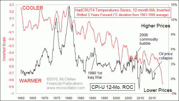
If the CPI inflation rate is to continue following the pattern of global average temperatures, as it has since the CPI was created back in 1913, then that means prices should see a big downturn over at least the next 3 years, based on the 3-year leading relationship shown in this chart.
Whether the Fed, the ECB, the Bank of Japan, and other central banks will follow that message is the great mystery that remains to be seen. But the message for us now is that while the 60-year cycle’s trend says interest rates should be going upward, the global average temperature data say that we are not yet done with the deflationary period for prices of “stuff”, and thus global interest rates are going to stay low for a while.
Tom McClellan
Editor, The McClellan Market Report
Jul 30, 2015
Debunking the Fed as the Controller of Inflation |
Aug 27, 2010
60-year Cycle In Interest Rates |
Oct 12, 2012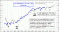
40-year Cycle In DJIA |