NYSE New Highs Data Say Uptrend Not Done Yet

Free Chart In Focus email
Delivered to you every week
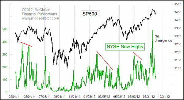
The uptrend should live on, at least for a while. That's the message from the NYSE data on the daily number of stocks making 52-week new highs (NH).
When an uptrend is about to end, it usually shows signs of tiring before actually turning down. This can take the form of momentum divergences, weaker Advance-Decline numbers, and other signs of diminishing participation. When the work of pushing the major indices to higher highs is being done by a smaller number of stocks, that is a good sign that the energy is waning.
We do not have such a sign yet, at least not from the daily NH data. There was a peak at 495 back on Sep. 14, which was the same day that the SP500 reached its peak, and one day after the FOMC made waves in the markets by announcing QEinfinity. Since then, the daily totals of NH have been lower, but so has the SP500. In other words, it is a normal response to the small price correction, and not a sign of a weakening of the upward surges.
This week's chart looks solely at New Highs, ignoring the total of stocks making new lows (NL). Looking at NL can be useful in a downtrend, to see big washout days that can mark at least a temporary end to an accelerated decline, but that data is not as useful during an uptrend.
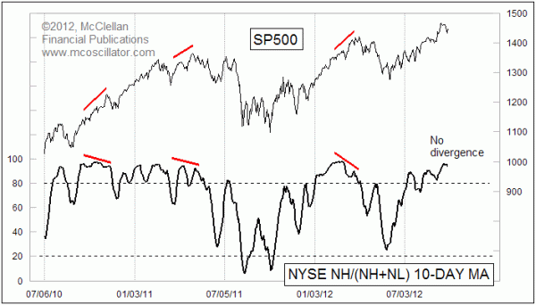
One way that NL can be incorporated with NH during an uptrend is in an indicator created by technician Mike Moody, CMT, who is a Senior Portfolio Manager for Dorsey Wright in Pasadena, CA. Several years ago he created the indicator in this next chart:

To create this indicator, we look at the number of NH divided by the total of NH plus NL, and then smooth it with a 10-day simple moving average. Like the raw number of NH, this indicator serves us best when it gives a divergence at tops, but it can also be useful for helping to mark oversold bottoms, when NH dry up completely.
The utility of adding NL into the calculation is that if you were to see an uptrend continuing with generally high and constant peaks in NH, but then you noticed that the numbers of NL were starting to increase, then that would be a sign that the uptrend was getting into trouble. And that condition would be revealed in this indicator because the denominator would be getting bigger with more new lows, thereby taking the ratio of NH to NH+NL lower.
We do not have that condition now, and instead it continues to confirm the higher price highs just like the raw NH numbers.
Tom McClellan
Editor, The McClellan Market Report
Mar 05, 2010
NYSE’s New Highs Confirm Uptrend |
Jun 15, 2012
Overbought McClellan Oscillator |
Apr 20, 2012
Summation Index Promises Higher Highs After Correction Ends |