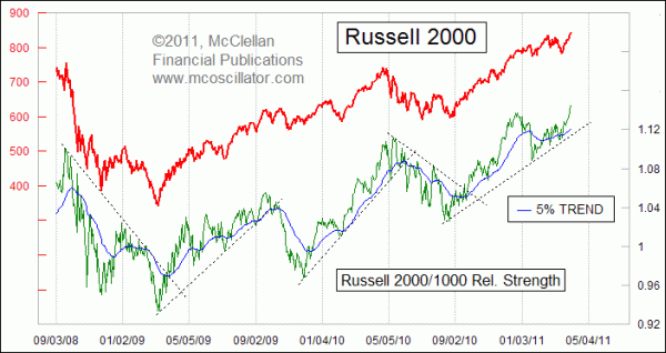
Small Caps Leading The Way
Free Chart In Focus email
Delivered to you every week
As the DJIA and SP500 struggle to eclipse their Feb. 18 highs, the Russell 2000 is already above its own prior high, and is leading the rest of the market higher. Seeing the Russell 2000 Index performing well is a bullish sign for the overall market, because it says that there is enough liquidity to go around such that even the less-deserving small cap issues can find the money needed to push prices higher.
One easy way to measure relative performance is by using a simple ratio of one item's price to another's. This is what pairs trading is all about. Most typically, relative strength ratios are used to depict a single stock's performance relative to a benchmark index, but we can also use this tool to compare two different indices.
This week's chart looks at a relative strength line for the small cap Russell 2000 Index versus its large cap brother the Russell 1000. When this line is rising, it means that the Russell 2000 is outperforming on a relative basis, either by going up faster or going down more slowly. Generally speaking, the overall market does better when small cap stocks are showing better relative strength. It is a sign that there is plentiful liquidity available to spread around to the large majority of stocks. This is the same reason why it is a bullish factor to have the A-D Line making higher highs.
When evaluating a relative strength line, one can use a variety of moving averages to aid in analysis. This week's chart shows a 5% Trend (aka 39-day EMA), and the trend for prices is generally upward whenever the relative strength line is above that moving average.
You can also do simple trendline analysis, as in the examples drawn into this chart. Often we will see a trendline on the relative strength line get broken ahead of the equivalent line on the price plot.
Following the March 2009 low, the Russell 2000/1000 relative strength Line has made a series of higher lows and higher highs. There has been no divergence yet between the Russell 2000 price index and the relative strength line. If QE2 ends and there is no QE3, then look for the relative strength Line to signal the reduced liquidity available to the market by declining and possibly creating a divergent topping structure. Divergences do not always appear, so don't count on seeing one. But when you see this relative strength line heading south this summer, you'll know trouble has arrived.
Tom McClellan
Editor, The McClellan Market Report
Dec 25, 2009
Small Cap Leadership Is A Good Thing |
Oct 08, 2010
Strength in Hi-Yield Bonds is Bullish For Stocks |
Jan 21, 2011
Why Even Fundamental Analysts Should Watch A-D Line |
Oct 29, 2010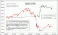
POMO: The Hot New Timing Tool |