SPECIAL EDITION - Bitcoin Follow Up
Free Chart In Focus email
Delivered to you every week
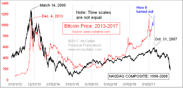
Bitcoin prices have burst out to a higher high, getting a lot of people excited. So I figured this was a good time for a follow up to my Jan. 26 Chart In Focus article.
That article a month ago illustrated the similarities between the price patterns in Bitcoin and the Nasdaq Comp from an earlier period. The chart above is the same one I showed in that earlier article, updated for how Bitcoin prices have behaved since then. One key point to observe is that the time scales for each plot are different. The Bitcoin pattern is tracing out roughly the same dance steps, but in a much shorter time frame.
The blue price plot shows how Bitcoin price have behaved since that Jan. 26 article. This breakout move to a higher high appears thus far to be echoing the final blowoff move that the Nasdaq had in October 2007, just ahead of the big bear market of 2008-09.
I do not know what factors might arise to push down Bitcoin prices, assuming that the analog continues the good correlation we have seen thus far. But I can say that anyone getting all excited about chasing Bitcoin prices due to the breakout might want to pause and reflect a bit.
Tom McClellan
Editor, The McClellan Market Report
Jan 26, 2017
Bitcoin is a Bubble We’ve Seen Before |