Steep Yield Curve Does Not Offer Complete Immunity
Free Chart In Focus email
Delivered to you every week
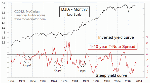
With the Fed keeping its foot on the neck of the interest rate market, and effectively keeping short term rates at zero, the net result is that we have a fairly steep yield curve. What that term means is that if you were to plot all of the different maturities for a type of interest bearing asset like T-Bonds, then a steep yield curve would be sloped from lower left to upper right, as in the small chart. An "inverted" yield curve happens when short term rates go up higher than long term rates, and it is a reliable sign that trouble is coming for the stock market and the economy.
Fed Chairman Ben Bernanke made a comment back in February 2007 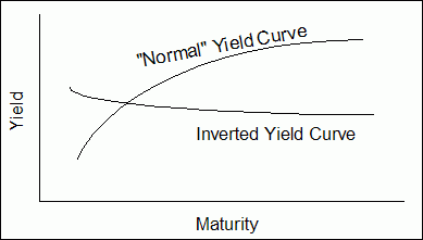 that will now go down as being among the worst quotes ever by a Fed chairman. Referring to the inverted yield curve then, he said that he did not foresee it as putting "tremendous pressure" on the banking sector. I bet he wishes he could take that one back.
We do not have an inverted yield curve now, with short term rates at near zero, and longer term rates above that. To get to an inverted yield curve now, we would need to see either the Fed raising short term rates, or the 30-year T-Bond zooming up to around a 240 price level. Neither is very likely, but as this week's big chart shows us, that does not necessarily immunize the stock market from trouble.
It is difficult to portray changes over time in all of the different maturities which make up the Treasury yield curve. So I am modeling the overall steepness or inversion of that curve by just measuring the yield spread between 1-year and 10-year T-Notes. The rise since the absolute bottom for this spread back in 2010 means that the yield curve is flattening somewhat, but still is a long way from being inverted. We can see that whenever this yield spread does go above zero, it nearly always means an important long term top for the stock market.
This is partly because the higher short term rates associated with an inverted yield curve do two harmful things. First, they make it more expensive for businesses to borrow needed capital, which therefore puts a squeeze on earnings and capital formation. Second, they attract money away from riskier investments in the stock market so that investors can take advantage of the higher short term yields elsewhere. That pushes stock prices down.
But the whole point of this week's chart is that the stock market is not necessarily immune from a big decline just because the yield curve is still "normal". The circled instances show periods when the stock market still managed to make an important decline. The one at the left end of the chart was the 1962 bear market, which saw a 27% drop for the DJIA. Part of that drop was that President Kennedy was putting pressure on the steel companies, as a favor to his union supporters, which included sending FBI agents to the homes of steel company CEOs late at night to notify them of the president's displeasure at their intended price increases for steel. Wall Street saw that as the government attacking business, and investors fled.
The second circled example was in 1978, when the Fed was actually raising short term rates but not fast enough to keep up with long term rates that were being driven higher by runaway inflation.
The third circled example was the crash of 1987. In September 1987, the month before the crash, the 1-year yield was at 7.67% while the 10-year yield was at 9.42%, creating a negative 1-10 spread of -1.75 percentage points. But that did not stop the stock market from undergoing the worst crash since 1929, helped out by Alan Greenspan taking office in August 1987 and wanting to "mark his territory" as the new dog in town. He surely succeeded.
So the point is that even though the Fed says it is doing "everything possible" to avert another big financial crisis and associated stock market decline, there are nevertheless some precedents for the stock market getting into trouble anyway.
Tom McClellan
Editor, The McClellan Market Report
Nov 08, 2012
Apple Walking In RCA’s Footsteps |
Jul 13, 2012
Stock Market Says We Can’t Solve Budget Problems With Taxes Alone |
Jun 01, 2012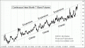
Full-On Panic Into T-Bonds |