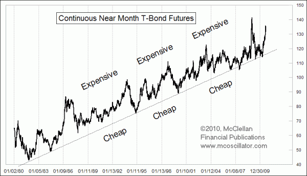
Trend Channel in T-Bond Prices
Free Chart In Focus email
Delivered to you every week
The trend channel is a classical chart analysis feature that technical analysts have used for years. It is characterized by generally trending price movements over time, with the upward and downward amplitudes being approximately equal.
This week's chart shows a great example of a really long term trend channel in T-Bond futures prices. Long term (20-year) T-Bond futures have been trading since August 1977, and this chart shows the price history since 1980. There is a great rising bottoms line that has seen multiple touches.
The upward excursions away from that line have been somewhat less disciplined at hitting a precise upper boundary line. How far up the price goes can vary somewhat in each instance, so it is not as if we can draw a "ceiling" line on the chart and know to sell when the price gets there. That would be too easy.
In last week's Chart In Focus article, we looked at a really long term view of corporate bond yields, which are down to the lowest level seen since the 1950s. Because yields move inversely to prices, a very low bond yield is the same thing as a very high bond price, like what we are seeing lately in T-Bonds.
The recent upward excursion in T-Bond prices has taken the price quite far above the rising bottoms line. Whether the recent high on August 24, 2010 was the highest we'll see for this episode remains to be seen. But it is fair to say that when T-Bond prices get extended pretty far above the uptrend line, the prospects for continued upward movement get less and less likely.
If the 60-year cycle model for bond yields is correct, then overall bond yields should see a general rise for about the next 30 years. This would mean that at some point the uptrend line in T-Bond prices will get broken. Calling for such a break to come soon is a bit premature. A drop which takes T-Bond prices back down to touch the rising bottoms line would be a decline of more than 13% from the recent high. Expecting a decline of more than that right now would be pretty ambitious, and more than what the data would seem to allow at the moment.
But it is fair to say that T-Bond prices appear pretty expensive up here, and would look a lot more favorable after a drop down closer to the uptrend line.
Tom McClellan
Editor, The McClellan Market Report
Aug 27, 2010
60-year Cycle In Interest Rates |
Nov 27, 2009
Why You Should Fear A Balanced Budget |
Jul 31, 2009
Spread between 2-year yield and FF rate |