Unemployment to Turn Up in 2013
Free Chart In Focus email
Delivered to you every week
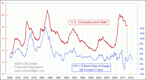
Back in August 2010, when the U.S. unemployment rate was still at 9.6%, I shared this week's chart with Chart In Focus readers under the headline of "Brightening Prospects For Employment". The basic idea is that the unemployment rate tends to echo the movements of the CPI inflation rate, with about a 2-year lag. So the expectation back in 2010 was for a drop in the unemployment rate as an echo of the drop in the inflation rate in late 2008 to 2009.
Sure enough, we did see a drop in the unemployment rate just as this model had predicted. Sadly, it was not as much of a drop as we all would have liked to see, but the direction was correct. Now this model has a much different message.
CPI inflation rates started turning upward back in December 2010, which means that we should expect to see a bottom for the unemployment rate 2 years later, or December 2012. The rise in inflation in 2011, which was fueled largely by rising oil prices, says that a RISE in the unemployment rate is already baked in for 2013.
The members of the Federal Reserve Open Market Committee (FOMC) do not seem to understand this. They are insisting that higher inflation is needed in order to help the economy, and fuel job growth. But this week's chart shows the opposite is true, that if the Fed could somehow just arrange for falling inflation rates and then wait two years, unemployment will respond. Perhaps Dr. Bernanke, et al, should read Aesop's fable, The North Wind and the Sun.
What we have seen in this relationship over the years is that the inflation rate determines the direction in which the unemployment rate moves, but other factors weigh on it also. So things that happen in Washington, DC or Brussels can have a big impact on the magnitude of the movements. Whoever gets elected (or reelected) in November will assuredly get the blame for the rise in unemployment during 2013 that was already baked into the cake by what inflation did in 2011.
Perhaps more importantly, if the Fed is successful in the months ahead at raising the inflation rate, as the FOMC says that it is intent upon doing, then we can count on seeing higher unemployment rates 2 years afterward, in a modern day repeat of the misguided monetary policies of the 1970s. Economists will start talking again about "The Misery Index", which is expressed as the coincident sum of the inflation and unemployment rates, even though the relationship is not a coincident one.
If the Fed members could just learn about the real relationship between inflation and unemployment, as shown in this week's chart, then they could make better policy decisions, and stop trying to be the wind that forces the economy to do their bidding.
They and others in Washington D.C. might also take a lesson from this 2011 article.
Tom McClellan
Editor, The McClellan Market Report
Aug 13, 2010
Brightening Prospects For Employment |
Jul 27, 2012
The Real Cause of Higher Grain Prices |
Mar 16, 2012
In Order To Tame Inflation, Just Tame Uncle Sam |