Source for Data on New Highs and New Lows
Is there any place where I could get historical new high/low data? How far back does it go?
We have NYSE NH/NL data going back to 1980, and Nasdaq data going back not quite as far. We also have NYSE A-D data as modeled and described in the Excel file available on our Market Breadth Data page.
Some data exist prior to 1980, but there is an interesting story about why the early data are not the same. The data which exist for NH and NL before our set were calculated a different way than how they are calculated now. It used to be that the NH and NL numbers were for each calendar year, not for a rolling 52-week look back period. But since starting a new set of calculations on January 2 would have every stock at either a NH or a NL, the people tabulating the data would extend the “year” until around April, while simultaneously starting a new set of records for the new year, and then in April they would switch to the new set. This was understandable in the age before modern computing capability, but it means that the earlier data are not the same as what we all look at today.
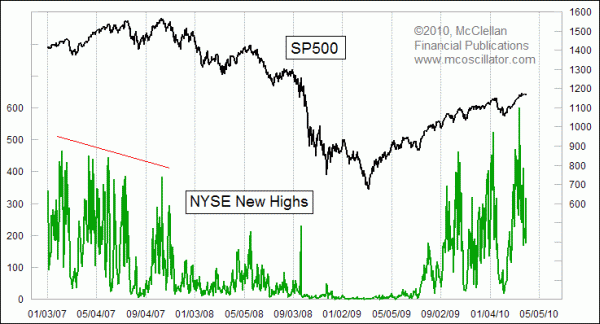
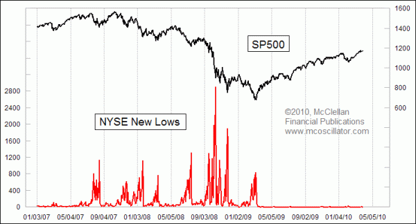
I will also share with you that highs and lows in the stock market have different behaviors. Market bottoms tend to be more focused emotional events, whereas tops are more diffuse. The difference is similar to the way a ball bounces in a series of parabolic arcs. The acceleration at the bottoms (the bounces) are much more acute and noticeable than the slow rollovers at the tops. So trying to adapt rules for bottoms to the hunt for tops is not likely to work due to the different personality of each type of event.
This difference in behavior results in the maximum number of New Lows being seen at the time of important price bottoms. The peak in New Highs usually appears before the final price high.
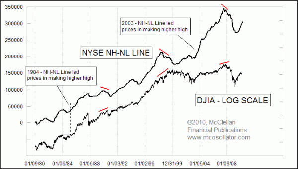
It is also possible to create an interesting indicator by finding the daily difference between New Highs and New Lows, and summing that over time. This is similar to the cumulative Advance-Decline Line. The chart below shows what this looks like, and it has a couple of important uses. First, it can signal overall market strength by moving up rapidly, sometimes even ahead of prices. Second, there have been 3 divergences in 30 years compared to the DJIA, and while that is not a very large sample size, each of the divergences carried a strong message about the waning health of the uptrend.
To see an example of using of this data in real time, read one of our Chart In Focus articles here.
To order historical NH/NL data, or to inquire about other types of data we have, call our office at (253) 581-4889.