Bond CEF A-D Line Showing Liquidity Problems
Free Chart In Focus email
Delivered to you every week
I used to believe as others do that the “proper” Advance-Decline (A-D) data come from the “common” stocks. After all, they are the real stocks, so they should know better what the stock market is doing. I stopped believing that once I looked at the data.
Among the supposed contaminants that ruin the purity of the composite A-D data are closed end funds (CEFs) which own various types of bonds (e.g. municipal, high grade corporate, etc.). These issues trade on the NYSE just as though they were regular stocks. And because they are sensitive to interest rates more than to the overall economy, some analysts look down their noses at them, and believe that they are ruining the overall A-D data by their inclusion.
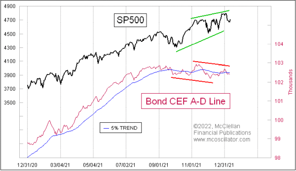
It turns out upon examination of the actual data that the bond CEFs actually give a really good message about the health of the liquidity stream that affects the entire stock market. So if anything, they are making the composite A-D data better by virtue of their inclusion in it. This week’s chart shows a big bearish divergence versus the SP500.
I possess this data, and as far as I know I am the only analyst who goes to all of this trouble, because years ago I decided to test the hypothesis that these supposed contaminants are ruining the composite A-D data. It took a bunch of working getting daily data on all of the NYSE stocks, figuring out which ones were bond CEFs, and then calculating advances and declines each day on all of those issues. I continue that work with the help of teammates, and occasionally share the insights in our McClellan Market Report and Daily Edition.
What I found was that the messages from these data are actually really powerful and important. I can now make the argument that the Bond CEF A-D Line may actually be better than the composite A-D Line, and it is certainly better than the “common only” version. See this link for more about the problems with the common only version.
I spoke about this point years ago with the late Richard Russell before he died. Russell wrote The Dow Theory Letters for 57 years, right up to his death in 2015. Along with the late Joe Granville, Russell helped to introduce the world to the use of the NYSE A-D Line in 1962. Before then, almost nobody used it or followed it, but it became popular that year because Russell and Granville showed their readers that it had made a big bearish divergence ahead of a 27% decline in the DJIA in 1962. Suddenly the idea that you could use the A-D Line to get a warning about a bad bear market like that was very popular.
Russell confided that the same criticism of the A-D data was offered back in the early 1960s, with critics noting that the NYSE had a bunch of utilities and insurance companies that were “interest sensitive”, and which were presumed to mess up the message of the data. So this criticism of bond CEFs in the modern A-D data is actually an old complaint still being recycled.
The message of the current divergence shown above is that liquidity has suddenly become a problem, and it is affecting the more liquidity-sensitive issues first. That can be a prelude to that same illiquidity coming around and biting the big cap stocks that drive the major averages.
It has been a while since we have seen a divergence like this one. There was a small one back in August 2020, leading to just a small amount of price damage in September 2020. The market quickly recovered from that one, seen in the middle of this chart:
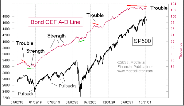
A lot of the time, this A-D Line serves to rebut the message of a price correction by staying strong, and telling us that whatever problems the stock market may be having are not liquidity problems. Emotional problems and news related stories are easier to get over more quickly than liquidity problems.
There was also a small divergence back in September 2018, a warning of trouble that unfolded for the SP500 in Q4 of 2018. By the time that the final price low came then, the Bond CEF A-D Line was making a bullish divergence, saying that liquidity had been restored, so the stock market should soon get over what was bothering it.
Those were very small divergences compared to the weakness we are seeing now. If we go all the way back to 2007, we can find another example of a big divergence between the Bond CEF A-D Line and the SP500.
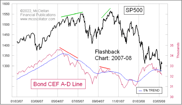
The final price high then did not come until October 2007, but the Bond CEF A-D Line had its peak all the way back in May 2007. By the time that the final price high came, this indicator had been screaming about big illiquidity problems. But few people other than my newsletter readers knew about that particular message.
Most who hear this message about the current divergence between the SP500 and the Bond CEF A-D Line won’t believe in it, because these bond CEFs are interest rate sensitive contaminants to the proper A-D data. This is actually fine with me that they don’t believe in it.
Tom McClellan
Editor, The McClellan Market Report
Sep 10, 2013
Bond CEFs Still Say Liquidity is in Trouble |
Apr 24, 2014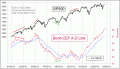
Bond CEF Update: Liquidity Is Plentiful |
Sep 10, 2021
High Yield Bond A-D Line Resolves Divergence |