Corporate Raiders Make a Run At Apple

Free Chart In Focus email
Delivered to you every week
I do not normally like re-runs of a particular story, especially when I just covered it here back in May. But recent news plus some chart events with the share price of Apple Corp (Nasdaq: AAPL) make it worthy of comment again.
Activist investor Carl Icahn (the guy who once destroyed TWA, etc.) recently made news and spiked AAPL's price upward when he sent out a message on Twitter, stating that he had bought into the company and also had spoken with CEO Tim Cook about increasing share buybacks.
Later, Icahn joked that "My Twitter keypunch guy at @Carl_C_Icahn messed up..I said I bought a BUNCH OF APPLES to the twerp not $1b in $AAPL"
I don't know if the SEC is laughing or not about this pretty blatant effort by Icahn to "talk his book", or in other words to seek higher share prices by promoting that he had bought in.
And now we find out from actual SEC filings that George Soros is reportedly also piling in.
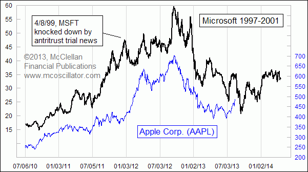
So is all of this a sign that AAPL really is breaking out of a big bottoming structure, and heading higher now that "strong hands" are buying its shares? Perhaps, but we should also consider the chart above, which still appears to be working. I introduced this comparison last year, showing how the movements of AAPL's share price in 2012 looked a lot like those of one-time tech darling Microsoft (MSFT) back in the era of the Internet Bubble's peak in 2000. And since introducing this comparison, it has continued to "work", for the most part.
By that I mean AAPL's price pattern has matched nearly all of the turns seen in the MSFT pattern. There was one notable exception, as highlighted in that chart. MSFT got knocked down in April 1999 on news of a Justice Department action in the antitrust case against Microsoft. AAPL chart plot did not match that one dance step, but otherwise has matched each of MSFT's major chart turns.
Interestingly, the magnitudes of AAPL's moves have not always worked out the same as what MSFT's prior pattern suggested. But the timing of the turns has been generally right.
And that's all the more relevant now, as we watch AAPL's share price break out to a 6-month high, on the news of all the big guys eyeing AAPL's cash hoard and getting active in owning its shares. The MSFT pattern has been saying that a run up to a top is due right about now, but that another down leg is ahead.
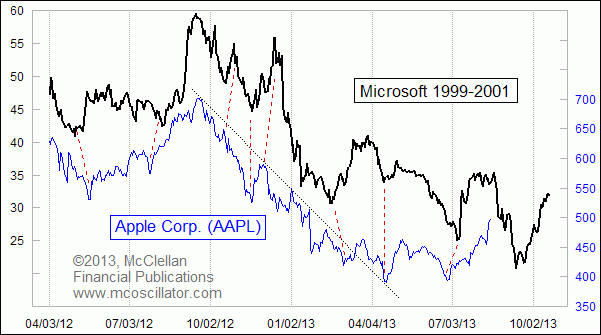
Here's a closer look at that same pattern analog:

This closer look reveals that there is a little bit of "accordioning" of the exact timing of the matching turns. But each of the dance steps does get repeated roughly on time, or at least they have up until now. So does that mean we are guaranteed to get the upcoming price drop repeated in AAPL.
Absolutely not. There are no guarantees.
But as we contemplate how this pattern analog fits with all the news stories about the big guys playing around with AAPL shares, it is important to understand that such stories often appear right as prices are topping. One famous example was a big top in silver prices back in 1997, a top which developed just a few days after Warren Buffett had revealed that he had taken a big position in silver futures. The crowd rushed in when they heard that Buffett had been a buyer. Those stories did not say whether Buffett still held those positions.
Trying to bet on a decline in AAPL right now, while the big guys are still having their effect on pulling in the crowd, is the upside-down equivalent of catching a falling knife. It can be dangerous. And it is even possible that this is the point when this pattern analog is going to break correlation, as all of them eventually do.
But the MSFT pattern should be a useful one for traders to keep in mind in case we do see a blowoff top and reversal in AAPL's share price. It says that a better entry point for investors is due in September 2013, rather than at a point of maximum excitement in the stock like we are witnessing right now.
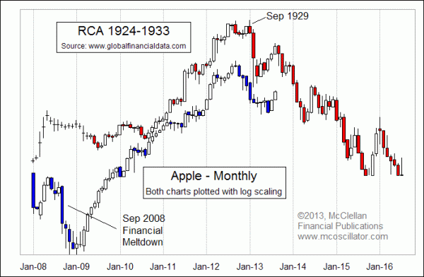
And here is one additional point to consider. This final chart is the one which first got me looking at AAPL now versus MSFT in 2000. With the help from the nice folks at Global Financial Data www.globalfinancialdata.com, I created this comparison to RCA back in November 2012, just after AAPL had its top at $705/share.

The point of that comparison was that RCA (Radio Corporation of America) had been the tech darling of the 1920s, the stock that "everyone" wanted to own. And AAPL has arguably been the tech darling of the 2010s based on the success of its phone and other products. The comparison is not between the companies themselves, but rather between their price patterns. It relates to the way that investors fall into and out of love with tech stocks. The actions of investors are what create the patterns in the share price, and so seeing similar patterns suggests that investors are going through the same stages of falling out of love with AAPL that they went through with MSFT in 2001, and RCA in 1930. Whether AAPL does a complete unwind like RCA did in the 1930s remains to be seen, but it's looking good so far.
Tom McClellan
Editor, The McClellan Market Report
May 10, 2013
Apple Still Following Microsoft’s Footsteps |
Jan 24, 2013
After The Fall, Revisiting Apple and RCA |
Jun 26, 2013
Gold is Following in Stock Market’s 2009 Footsteps |