How Valuation Behavior Has Changed Over The Years
Free Chart In Focus email
Delivered to you every week
I have been writing professionally about the financial markets since 1995, and in all of that time I have almost never referenced valuation. It is not because valuation does not matter, but rather that valuation does not give any useful insights to solve my puzzles about what the market is going to do and when. Valuations can get way more stretched than they ought to, in both directions, and so noticing that they are stretched (or not) is of really no functional use.
Stretched valuations can sometimes tell you about how far valuations will have to go as they revert to the mean, but history shows that “the mean” does not really show us where that reversion will stop. It can and does go much farther.
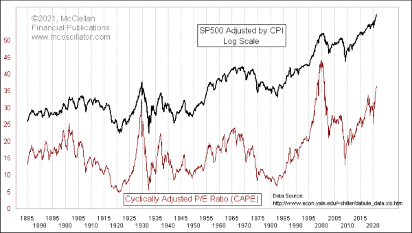
This week’s chart shows that valuations are assuredly stretched. I am grateful for the work of Dr. Robert Shiller of Yale and his staff for the data in this week’s chart, data which you can access at http://www.econ.yale.edu/~shiller/data/ie_data.xls. Shiller’s “Cyclically Adjusted P/E” (CAPE) ratio of the SP500 (and prior proxy data thanks to the work of the Cowles Commission) adjusts the earnings numbers with a 10-year smoothing. While the current readings are very high, there is no natural boundary which says that if it gets up to a certain level, then something has to happen. A correction perhaps should happen, but not on anyone’s schedule.
If we flip the P/E ratio upside down, we get the earnings “yield”, which is then comparable to the dividend yield, or bond yields, or really any other type of yield rate. That is what is shown in this next chart.
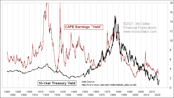
What I find interesting in this week’s chart is the manner in which valuations have tended to matter more in recent decades than they used to many years ago. This chart compares the CAPE earnings yield to the yield on 10-year Treasury instruments. Data for both of these series are provided by Shiller’s team at that link above. Some compromises have had to be made in compiling these data, because the definitions have shifted over time for what “earnings” means for publically traded companies. And the Treasury Department’s own data on 10-year T-Note yields only goes back to 1962, so some proxy data has had to be used in this series for the earlier years.
That point in the early 1960s is where this comparison gets interesting. We see a fairly tight overlap of the 10-year yield data and the CAPE data since about the early 1960s. Before then, the two plots are wildly different, although still sort of correlated in the direction of their movements. But it is not just a case of having the new “correct” data for 10-year yields beginning in the 1960s and thus making the overlap more true. Other factors were involved.
Graham and Dodd published their famous book The Intelligent Investor in the 1940s, about doing valuation analysis of individual companies. Fama and French published their “Three-Factor Model” for asset pricing in 1992, which expanded on the “capital asset pricing model” or CAPM which was invented by William Sharpe and John Lintner in 1964 and 1965. So the 1960s saw the confluence of better 10-year yield data and a growing awareness in asset management circles of the relationship of bond market valuations to the stock market.
From the early 1960s to the early 1990s, there was pretty good agreement between the two plots. But then the Internet Bubble of the late 1990s caused the CAPE yield plot to drop far below the 10-year yield plot, reflecting the big overvaluation then of the stock market. That occurred, in part, due to the Fed’s overstimulation of the financial system, partly due to worries about the Y2K bug’s risk factors for the banking system. All of that excess stimulation went in part to fueling the speculative bubble in the hot new fashion, which was Internet stocks.
The collapse of the Internet Bubble caused the two plots to get back more into coincidence with each other for a while, until the housing bubble collapse of 2008 (exacerbated by the Fed’s tightening) caused the CAPE earnings yield to spike up to a really high level. That spike was not at all in keeping with the bond market’s message. It was a reflection of the great opportunity represented at the 2009 stock market bottom, from which the SP500 has gone up now almost 7-fold.
The current CAPE yield is still well above the 10-year yield, thanks in part to the Fed’s QE efforts putting a thumb on the scale of the bond market’s message. One could argue, therefore, that the stock market is momentarily “undervalued” compared to the 10-year yield. But would that be a useful argument to make? That is a tough question to answer, as posed.
It is assuredly fair for us to say that when the 10-year yield is rising over a multi-year period, that is generally not a great time for those who are hoping to see higher P/E ratios in the stock market. Breaking down that statement, if the 10-year yield keeps on rising, as the 60-year cycle in interest rates tells us to expect that it will until around 2040, then earnings multiples are going to contract, and thus stock prices should not be trending up the way that we have gotten used to in the modern era of quantitative easing (QE).
What is not fair to do is to pick out some supposed 10-year yield at a future point in time, and conclude therefore that the earnings yield will necessarily match that, and thus give us a price target. The performance of the data over multiple decades shows us that the stock market is just not that precise in matching such expectations. It would be fun if it was, because that would make analysts’ jobs much easier. But that is not the market we get to play in.
And to remain a long-term bull on the stock market now would require one to expect that the 10-year yield will continue to stay at record low levels, thereby justifying the ridiculously excessive P/E ratios we are seeing now. That too seems like an unsupportable hypothesis.
Tom McClellan
Editor, The McClellan Market Report
Jul 07, 2016
NIRP Disrupting 60-Year Cycle |
Oct 12, 2012
40-year Cycle In DJIA |
Jan 31, 2020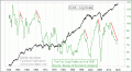
How are Stocks Going Up While Earnings Go Down? |