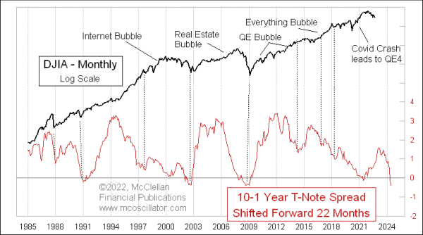
Inverted Yield Curve Means 2024 Bottom
Free Chart In Focus email
Delivered to you every week
The Fed’s rate hiking at the short term end of the maturity spectrum is outpacing the rise in long term yields, which is resulting in an inverted yield curve. The term “yield curve” refers to the yield on every maturity from 1-week to 40 years, which is difficult to portray in its entirety, especially as it changes over time. This week’s chart looks at one snapshot out of the whole yield curve, the spread between the rates on 10-year and 1-year T-Notes. It is now negative, meaning that the 1s are above the 10s, and to the largest degree since 2008.
Inverted yield curves have a perfect track record going back decades for predicting recessions. So let not your heart be troubled about the question of whether we are going to have a recession. We are for sure going to have one, so you don’t need to worry over that question any more.
The question we should still worry about, though, is what that means for the stock market, and the answer there is not as clear. It can be possible to see stock prices go up with an inverted yield curve.
The real pearl of wisdom that we have found in studying these data results from offsetting the plot of the 10-1 spread forward by 22 months, which is what this week’s chart shows. Doing this allows us to see that the stock market typically makes an important price bottom about 22 months after the 10-1 yield spread bottoms out.
We do not know yet that this spread is bottoming out now, so we cannot start that 22-month clock just yet. Once we see a bottom in the 10-1 yield spread, then we can start anticipating an important stock market about 22 months later.
There are caveats, though. The 10-1 yield spread had told us to expect a bottom in early 2021. That got foiled by the arrival of Covid in early 2020, which led to the March 2020 Covid Crash, and the Fed’s decision to start QE4. This disrupted lots of models, cycles, and other predictions of what the stock market was going to do. So we should not necessarily fault this model for failing at a time when the Fed was throwing $1 trillion a month at the stock market.
We should, though, keep that principle in mind when 2024 gets here, and we perhaps get to see this model working again to mark an important bottom. And 2024 is when crude oil’s 10-year leading indication is saying we should expect to see the start of a really big bear market, which fits with the message of this yield curve model.
Tom McClellan
Editor, The McClellan Market Report
Mar 04, 2022
Flattening Phase of Yield Curve Cycle |
Apr 02, 2021
Clarifying Oil’s 10-Year Message For Stocks |
Dec 10, 2021
2-Year Yield Putting Pressure on Fed to Raise Rates |