Obama’s 2nd Term Much Like 1st for Stock Market
Free Chart In Focus email
Delivered to you every week
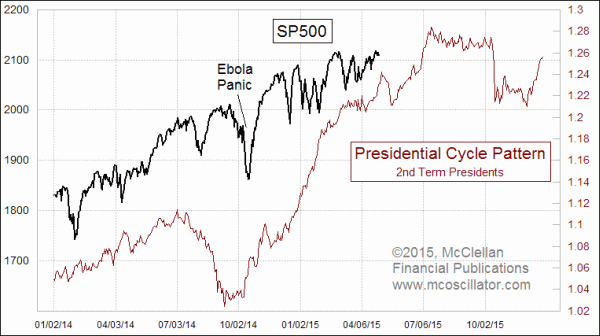
We are now in the second term of President Obama’s term in office. While the Presidential Cycle Pattern shows similarities among all presidential terms in the stock market’s behavior, it is poorly appreciated how the 2nd term is often different from the first in its character.
The lead chart this week compares the current behavior of the SP500 to an average of that same index’s behavior during second presidential terms. The correlation is very good, except for a few exogenous events along the way, most notably the Ebola Panic in October 2014. If the correlation continues as well as it has been doing recently, then we should expect a pause in the uptrend in May, followed by a resumption of the advance toward a top due in July.
While it is normal for first terms and second terms to differ somewhat in the stock market’s price structure, what we have seen very recently is a strong similarity in the stock market’s behavior during President Obama’s first term compared to his second. Once again, a few anomalous events have skewed the correlation, but the market seems to return to its normal path once the anomalous period is past.
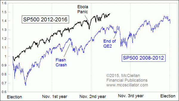
If the correlation of the first and second Obama terms persists, then there is another top on the horizon around early July, the echo of the top that marked the end of QE2 in 2011. We do not have the prospect of a similar Fed move this time, and yet the pattern has been strongly similar to what happened 4 years ago.
I cannot yet write the news that will explain why the stock market might struggle after a July top. But we can see that similar up and down movements have easily unfolded before, and so it should not be a surprise to see the movements repeated in 2015. Exactly when the turns will come is something we will endeavor to address and refine within our twice monthly McClellan Market Report newsletter and our Daily Edition.
Tom McClellan
Editor, The McClellan Market Report
Aug 07, 2014
2nd Presidential Years Are Different |
Nov 05, 2010
Entering the 3rd Presidential Year |
Sep 25, 2014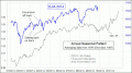
September Seasonality Finally Shows Up |