What Debt Default Means For The Stock Market

Free Chart In Focus email
Delivered to you every week
Here is a riddle for you to ponder. I'd like you to consider a hypothetical situation, with these economic parameters: US unemployment is above 9%. The federal government is running large deficits. A summer decline has investors worried. And this comes after several years of sideways price movement for stocks.
Now, into that environment, imagine that a populous country and important trading partner of the US announces that it is going to default on foreign debt equivalent to about half the size of its GDP. And imagine that this default soon spreads to several other countries.
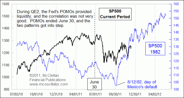
So given all of these conditions, what happens to the stock market? For the answer, see this week's chart. The scenario I described was the default of Mexico in August 1982, which soon spread to defaults by 26 other countries. See http://www.fdic.gov/bank/historical/history/191_210.pdf for the longer version of that story.
The fascinating point about this comparison is that the current stock market price behavior matches quite nicely with what we saw after the bottom in 1982, a bottom which coincided with Mexico's debt default. The current version of debt default is a "haircut" for Greek debt holders, unfortunately including customers of MF Global who did not even know that their "cash" positions were actually invested in troubled European debt instruments. That whole episode is a story worthy of a book-length description that is beyond the scope of this brief article.
Why it could be that the default of Mexico could be good news in 1982, and Greece in 2011, could be good for the stock market is an interesting mystery. But the correlation is there in the stock price patterns, or at least it has been ever since July. Prior to July, when the Fed's QE2 program of bond purchases was in effect, the correlation between these two price patterns was not that good. In fact, at times the patterns seemed to have a loose inverse correlation. But the end of QE2 on June 30 resulted in a liquidity vacuum which seems to have jolted the current market price pattern into sync with that of 1982.
The December 2011 price action does not match the 1982 pattern of higher highs, but the timing of the turns does match up, and that is the important point for watchers of analogs like this. It is the turns that matters more than the price levels suggested by the slope of the prior pattern. And the turns in the 1982 pattern suggest that we should see a big rally into the end of December, followed by some time to think about things.
You can see a video of the discussion of this pattern and other topics that I had in an appearance before the Seattle Securities Traders Association. Click on THIS LINK to watch the 72 minute video.
We'll be watching how it actually plays out in our twice monthly newsletter and Daily Edition, and invite you to join in by subscribing here.
Tom McClellan
Editor, The McClellan Market Report