Election Years Are Different
Free Chart In Focus email
Delivered to you every week
We are now firmly into this election year, with both major parties' candidates determined. This moment is pretty early for that type of resolution. It has also been more than a century since a former president served as a major party's candidate seeking reelection (and no, Teddy Roosevelt's Bull Moose Party run in 1912 does not count).
Most of the time, election years are up years for the stock market. But there are big differences during the year depending on whether there is an incumbent first term president running for reelection, versus when a 2nd term president is term limited from running again. We are in the first circumstance this year.
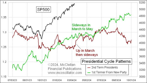
I have been writing about the Presidential Cycle Pattern since 1994, using the pattern which is derived from averaging together SP500 price data in 4-year chunks of time. One difference in how I do this versus others is that I start each 4-year period as of Nov. 1 instead of Jan. 1, to better align with election day.
This week's chart looks at the differences (and similarities) in the versions of the Presidential Cycle Pattern depending on what type of president is in office. The green line reflects first term presidents from a different party than the last president, and reflects the condition we have now.
A lot of the time, the two patterns behave very similarly. But in March of the election year, there is a notable difference. When a first term president is in office and running for reelection, March is typically a sideways month, part of a larger sideways pattern lasting all the way until late May. March is different, though, when a second term president is in office (red line). I do not have a good explanation for that difference.
From April to July, the two patterns behave very much alike. But July is when the political parties typically start holding their nominating conventions, and the news coverage begins to heat up.
The stock market normally rallies from June all the way to election day when there is an incumbent running for reelection. And usually an incumbent will win reelection. That is how things normally go.
The red line veers downward starting in July, reflecting how investors start to feel more nervous about the impending certainty of getting an unknown new president from the November election. Fear of the unknown is the biggest fear for investors.
This year, we cannot necessarily set aside the message of that red line. President Biden's health issues and low approval ratings make it much more likely than normal that someone else will be named as nominee at the Aug. 19-22, 2024 convention. That throws off the normal presumption about how the incumbent 1st term president usually wins reelection.
And this year we have a challenger who is not an unknown quantity (to Wall Street), who at the moment has a slight lead in the polls. This type of condition is totally backwards from how election years usually go. Add to that the additional unknowns about how President Trump is facing multiple trials for alleged crimes, and we have an election year completely unlike any previous one. So trying to run a forecast model based on how things have gone in prior election years may just not work this year.
Tom McClellan
Editor, The McClellan Market Report
Dec 06, 2019
Presidential Cycle Pattern and an Election Year |
Sep 08, 2012
Election Year Differences |
Oct 05, 2023
Entering the 4th Presidential Year |