Inflation Rising Right On Schedule
Free Chart In Focus email
Delivered to you every week
It makes a lot of people uncomfortable when I talk about the interrelationships between climate data and economic data. This is not how people were taught to think in their college economics classes, about how the economy supposedly works, and so it must be some kind of voodoo. But irrespective of how people feel about such information, there is a lot we can learn from it.
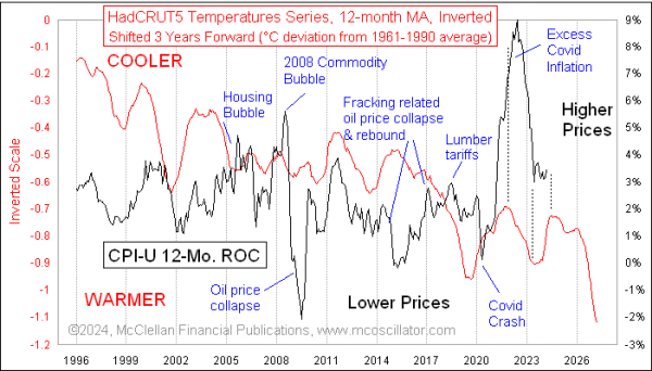
We are now seeing signs of inflation turning higher, not just in the CPI numbers but also in the Fed's favorite measure, the PCE deflator. This rise is arriving right on schedule, according to the relationship shown in this week's chart. It compares the 12-month rate of change for the CPI-U (for all urban consumers) to an index of global average temperatures.
HadCRUT5 is the 5th different series (T5) put out by the team at the Hadley Climate Research Unit (HadCRU) at the University of East Anglia in England. This plot of global average temperatures is posted in this chart on an inverted scaling, the better to show the correlation with inflation data. And the HadCRUT5 plot is also shifted forward by 3 years to reveal how the effects of temperature changes on inflation are lagged. In other words, the changes in global temperatures have a delayed effect on prices.
Temperatures are not the only factor influencing the inflation rate. This chart notes several important anomalies, when unusual governmental pressures or weird market events temporarily bent the plot of the inflation rate. Covid was a great example, initially causing prices to drop sharply as consumption dropped in the early days of the pandemic. And then inflation spiked far more than called for thanks to the combined effects of the Fed throwing $1 trillion per month of QE4 at the banking system, and Congress throwing its own piles of cash at the problem. Complications in the supply chain also had an effect (remember all of those container ships which could not get into the Long Beach, CA harbor). The Covid-related rise in inflation did come on schedule, but it went on a little bit longer and had a much greater magnitude than it should have, thanks to all of that governmental "help".
Inflation has also come back down on schedule, according to the temperatures data, leading the Fed and the White House to declare victory over calming the inflation pressures. But that declaration was premature, as inflation rates are now pushing higher again, just like this model says they are supposed to be doing.
The upcoming inflection point in the temperatures data equates ideally to May 2024 for the inflation rate, so the rise in inflation measures that we are observing right now should not last for very long. But the news will last a little bit longer, because the reporting of those inflation data is not instantaneous. And the model shows that the inflation rate will come down slowly, at first.
We are likely to see much bigger drops in the inflation rate over the next 3 years, as the warming of the recent big El Niño works its way through the economy. That warming got a big boost from the eruption of the Hunga Tonga volcano starting in December 2021, which blew a whole lot of water vapor into the upper atmosphere. CO2 gets all the headlines as a "greenhouse gas", but most people are unaware that water vapor actually accounts for around 89-92% of the capture of outbound longwave infrared radiation, i.e. the so-called greenhouse effect. And so blowing a bunch of extra moisture into the upper atmosphere amplified that effect for a while. La Niña should return, and start bringing down average temperatures again soon.
It is also not widely reported by the media that periods of warming temperatures tend to be better for agriculture, increasing crop yields and thus driving down food costs. That likely is the mechanism behind why the CPI data lag the changes in temperatures by 3 years, since changes in food prices tend to take a while to proliferate through the system and effect prices of other things.
Before you go thinking that this is just a spurious correlation during the period shown in the chart above, let me assure you that this has been going on for decades. Here is a longer term version of that same comparison, again employing an inverted temperature plot and a 3-year time lag.
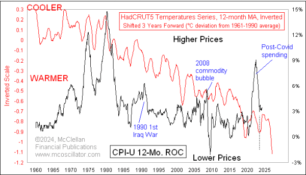
The important point to observe is not so much the overall trend in both data plots, but rather the manner in which the fluctuations in temperatures get echoed 3 years later as corresponding fluctuations in inflation data. The big inflation that we saw in the 1970s was the echo of a cooling period in the 1960s and 1970s, something that had climate scientists worried about the coming of a new ice age.
Inflation rates peaked in 1980, and the then-chairman of the Federal Reserve, Paul Volcker, has been credited by politicians and economists with supposedly conquering that high inflation. But in reality, it was the arrival of a warming period starting in 1977 that should get the credit.
This chart also shows that the first Iraq War in 1990-91 created a large anomaly in the inflation data, which the temperatures data did not call for. It is understandable that when a war brings about a temporary doubling of the price of crude oil, that it is going to cause inflationary effects which the temperatures data 3 years earlier might not have foretold.
No one should look at this chart and think that the temperatures plot is "accurate". It is theoretically possible to calculate an average temperature for the planet, if you had enough reliable thermometers in enough places, and could reliably combine those data. But thermometers are fussy things, and siting them well has been a well-acknowledged problem. Here is a weather station at the airport in Rome, Italy.
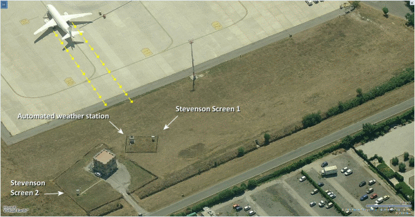
A lot of weather stations are in cities, because that is more convenient, and things like buildings and asphalt road surfaces tend to hold onto heat, creating the well-known "urban heat island" (UHI) effect. Putting these stations at airports is even more problematic, as in this example from Rome, Italy. So the numerical value of any temperature data is going to be necessarily suspect. But the variation in temperatures can still be informative.
Similarly, any attempt to quantify the "average" of prices for things is going to be complicated and fraught with problems. That is why we have CPI-U, CPI-W, core CPI, PPI, PCE deflator, and so many other permutations. Again, the numerical value anyone comes up with will need to be viewed with great suspicion. But the movements of those values can be informative.
Looking at that lower chart of temperatures versus CPI changes, the big recent change in the temperatures plot (warming) would seem to imply a big negative excursion for the inflation rate in 2025-27, but this is not the right way to look at its message. The leading indication is more about the direction of movement and the timing of the turns than it is about the magnitudes of the movements of inflation rates. There are lot of man-made factors which would inhibit price changes from actually going negative. We humans don't like to cut prices for things we sell, especially for our labors. But the message here is that once we get past mid-2024, inflationary pressures should start coming down, and keep going for at least the next 3 years.
And whoever gets elected in November 2024 will assuredly claim credit for that.
Tom McClellan
Editor, The McClellan Market Report
Jul 30, 2015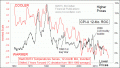
Debunking the Fed as the Controller of Inflation |
Aug 17, 2022
5.31-Year Cycle In CPI Inflation Rate |
Dec 17, 2021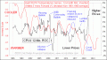
The Planet Has Something to Say About Inflation Being “Transitory” |