Strong RASI Promises Higher Price Highs
Free Chart In Focus email
Delivered to you every week
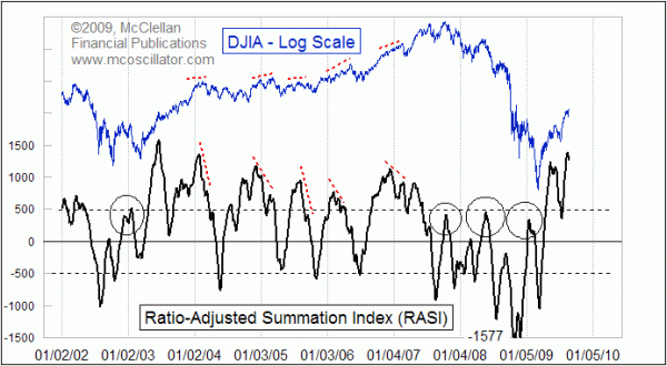
The Ratio Adjusted Summation Index (RASI) is a newer version of the classic Summation Index that has now been around for 40 years. The RASI is especially useful when wanting to make long term historical comparisons of market action. And it is also extremely useful for identifying when an uptrend is or is not strong enough to continue.
For a primer on the RASI, see our article on the Ratio Adjusted Summation Index. When the market gets oversold enough to take the RASI below -500, it is set up for an important bottom. The nature of the rally out of such a bottom can tell us about what lies ahead. If the RASI can rally up to above +500 (the higher the better), then that says the market is strong and the uptrend ought to be able to continue. Failing to get the RASI above +500 says that the uptrend is weak, and that the recent price lows are likely to be revisited. The circles in the chart highlight examples of such failures.
Coming up out of the March 9, 2009 price bottom, we saw a very strong initial up wave that took the RASI up to +1236 by May 12, 2009. Right then, the RASI was saying that the market was no longer in the mode of making failing rallies and then heading lower. After a brief rest period, the RASI then shot up even higher, to a high (so far) of +1393. This is very strong behavior, and is indicative of the plentiful liquidity that has been flowing into the stock market. A high RASI also means that the uptrend has gotten a bit overdone, and so some natural consolidation and correction should be expected.
In the weeks following a very high RASI reading like this one, it is normal to see prices move generally sideways, with a few small but scary dips just to keep the bears interested. The RASI will decay back downward toward its neutral level at zero, and prepare for the next upward move. The very high RASI reading we have just seen is reminiscent of how the uptrend was initiated in 2003, which is visible at the left end of the chart. That initial high RASI was followed by a succession of lower RASI highs, each of which was still high enough to say that the uptrend had strength to continue. The completion of each upward advance typically shows a divergence between prices which make a higher high and the RASI which makes a lower high. This is normal, and is something that we have not seen yet on this current advance. Whether or not 2009 sees the typical bearish seasonality in September and October, the strength we have seen this summer tells us that we should expect to see higher price highs in the months ahead.
Tom McClellan
Editor, The McClellan Market Report