Tracking Data on Police Officer Deaths
Free Chart In Focus email
Delivered to you every week
We are told by news reports that there is “an epidemic” of killings of police officers. That sort of report surely gets attention, and seems to have merit based on the individual stories about the racially-motivated attacks on police. But is there really a trend?
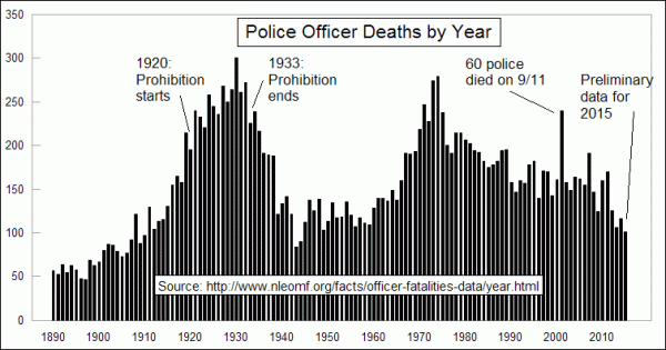
The National Law Enforcement Officers Memorial Fund tabulates on-duty deaths of law enforcement officers. The numbers in the chart above are raw numbers for all deaths from all causes, including accidents as well as assaults. These are raw numbers, with no adjustments for population growth or changes in the numbers of police officers in service. There is a definite non-random pattern showing in the annual bars.
Why is this of interest to a stock market analyst? Stock price behavior is a social science phenomenon, and so the cyclical forces which drive all of the social phenomena we might talk about could potentially have an effect on stock values, interest rates, etc. The stock market is perhaps the largest social science laboratory ever created. So the phenomena that cause humans to make decisions should be of interest to every stock market analyst.
Parts of that non-random pattern make some sense, from an historical perspective. At the start of Prohibition in 1920, there was suddenly a big participation of organized crime in the economy, and ongoing battles with police. Think Al Capone, John Dillinger, or Bonnie and Clyde. When Prohibition ended in 1933, there was a dramatic drop off in police officer deaths.
But both the uptrend of the 1920s and the downtrend of the 1930s were already established trends before those changes to the law. That makes it hard to fairly assign cause and effect to just the changes in the laws related to alcoholic beverages.
Another big spike in police officer deaths occurred in the 1970s. That could perhaps be attributed to the negative mood of the public related to the Vietnam War, and the Watergate scandal that led to President Nixon’s resignation in 1974, which was the same year as the peak in police officer deaths. There was also an Arab Oil Embargo in 1973-74 which contributed to a foul public mood, especially toward authority figures like police officers.
Since 1974, there has been a definite downward trend in police officer deaths, which is to be celebrated. The numbers are still too high, and every death is a painful and unacceptable wound upon our society which is hard to take. But the data do not (yet) support the idea that there is a strong new uptrend in police on-duty deaths.
So what explains the up and down trends we have seen over the long march of history? A cursory look shows that it does not make sense to blame unemployment or inflation for rising and falling crime rates. When the Great Depression arrived in the 1930s, the numbers of police officer deaths per year were already in decline from the 1930 peak and they continued to decline even as the economic slowdown worsened. Police deaths continued to decline all the way until the start of WW2.
There was a steady rise in police deaths during the 1960s until that aforementioned 1974 top, but inflation and unemployment continued to rise into the late 1970s. When the unemployment rate peaked in 1982, the annual rate of police officer deaths had already been in decline for 8 years. So it would not be fair to say that the great unwashed masses were responding to their poor economic conditions by killing more police officers.
So what then does explain it? I think I have at least a partial answer. Thanks to data from the Centers for Disease Control (CDC), I have annual US birth rate data back to 1909. Here is how the birth rate data compare to the police deaths data:
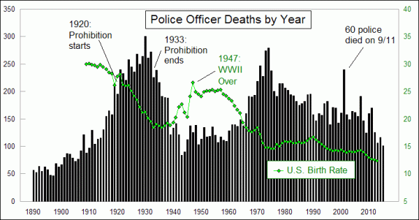
Upon first examination, there seems to be an inverse relationship in these two data series. As police officer deaths rise, birth rates fall, almost as if unsafe conditions would make couples less willing to bring another life into the world, whereas safer conditions result in a rising birth rate. But the correlation is not quite right at certain times, so maybe that is not the right explanation.
A better answer has to do with the notion of a leading relationship of one data series for another. Here is a chart showing the same two data series, but the difference is that I have shifted the birth rate data forward by 20 years:
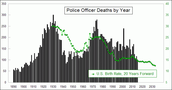
What this adjusted chart reveals is that higher birth rates tend to result in higher rates of police officer deaths about 20 years later. Maybe the offset should be 19 years, or 21 years. We can quibble about that, but the basic point is that having more 20ish people running around tends to result in more police officer deaths.
This makes behavioral sense from a developmental standpoint. A 20-year old is old enough to have the capability to get into a high-speed car chase, and to get into a more deadly type of confrontation with a police officer than a 10-year old is. And by the time a person survives past his teens and 20s to get to his 30s or 40s, he is arguably less interested in engaging in the sort of juvenile misbehavior that tends to get both suspects and police killed.
Birth rates do not give us a perfect explanation of the rate of police deaths each year, but there is a definite contribution to the cyclicality of those data. Police officers now have the benefits of technology in the form of body armor, seat belts and air bags, plus better communication capabilities, and those all are assuredly saving lives. The good news for police departments is that the declining birth rates of recent years should translate into falling rates of police officer deaths over at least the next 18 years (final birth rate data are current through 2013). That is little consolation for the families of those officers who will die in future years, while in service to their communities. And the declining birth rates have other economic problems associated with them, as I have written about previously.
But the point is that we should not fall into the trap of believing that the recent uptick in violence against police officers is part of some large new statistical or societal trend.
Tom McClellan
Editor, The McClellan Market Report
Sep 30, 2015
Spending Our Grandchildren’s Money |
Apr 23, 2010
Home Prices and the Birth Rate |
Feb 12, 2010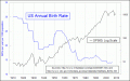
Birth Rate and the Stock Market |