A Scary Valuation Indicator
Free Chart In Focus email
Delivered to you every week
If you want to get worried about long-term stock market valuations, this week's chart should do the job. I saw a version of this chart recently in a research report by Daniel J. Want, who is Analytics Director for Prerequisite Capital Management in Queensland, Australia.
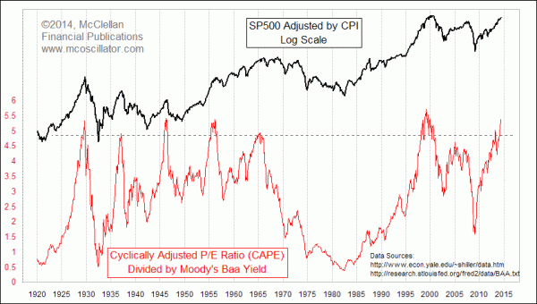
What is unique about this indicator is that it combines two separate data series into one indicator. When I first saw the version of this chart in Daniel Want's report, I thought it was just wrong to put the CAPE data together with the Moody's Baa yield, since the two are actually strongly correlated. So combining them together just magnifies the same message.
This is because the P/E ratio is the inverse of the "earnings yield", which should reasonably match up with bond yields. If an investor can get a better return on his money in the bond market, then he will flee the stock market, or vice versa. That is what keeps the earnings yield and bond yields in correlation. But when investors are bidding up stock prices to a ridiculous point such that the earnings yield is way out of whack from the bond interest yield, then there can be a big problem.
But the more I thought about it, the more I saw the beauty of this approach of combining the two. Low interest rates are usually associated with periods of high P/E ratios, but not always. Sometimes the market's average P/E ratio can get to a high level because earnings fall to a low level in a recession, as opposed to prices going way up above where they should be. In 2008-09, for example, the SP500's raw P/E ratio sky-rocketed, not because prices were too high, but because earnings were unnaturally too low.
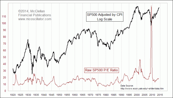
Analysts have struggled for years to make meaningful use of overall market P/E ratios because of problems like these. Professor Robert Shiller of Yale University uses one method to deal with this, which is to calculate a "Cyclically Adjusted P/E" (CAPE) ratio. This is the same Prof. Shiller who wrote the 2000 book "Irrational Exuberance", and whose name is attached to the S&P Case-Shiller Home Price Indices.
Shiller's CAPE looks at each month's inflation-adjusted (by CPI) real price for the SP500, and compares it to the 10-year average of real earnings. The intent is to smooth out the earnings fluctuations across one or more business cycles, which is an idea that dates back all the way to the work of Graham and Dodd in the 1930s. CAPE does a better job than the raw P/E ratio of identifying extreme high and low valuation levels:
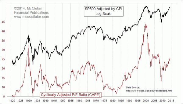
The extreme peaks and valleys are smoothed down somewhat, but we still are confronted with the difficult task of determining how high is "too high". The CAPE peak at the 2000 bubble top was well above everything else in the record, even including the 1929 stock market top which preceded the Great Depression. But just because the CAPE level got up that high did not mean that the stock market had to roll over right away. It stayed at a lofty CAPE ratio level for many months before the Internet bubble finally burst and caused stock prices to turn downward.
The indicator which Daniel Want featured in his report seems to solve some of those problems. For the record, Mr. Want states that he saw it elsewhere and cannot remember the source, but he added it to his toolbox a long time ago after seeing the nice properties it displays. I am a big fan of giving attribution to the creators of original ideas, whenever I can figure out who they are. So I'll give a tip of the hat to Mr. Want from whom I learned about this tool, even if I cannot yet discern the true originator.
"Baa" is a bond quality rating assigned by Moody's, and it means that the bond instruments with that rating "are subject to moderate credit risk. They are considered medium-grade and as such may possess certain speculative characteristics." The monthly Baa rate used in this week's chart comes from the St. Louis Federal Reserve's Economic Database (FRED), and is the monthly average of daily yield data on all of the Baa-rated corporate bonds.
The magic of the composite indicator in this week's chart is that by adjusting CAPE for the Moody's Baa yield, the result seems to set a much more uniform ceiling for how high valuations can go. Getting above a certain level says that the market is really getting to the edge, and is near a MAJOR price top. And that is the message of this week's lead chart, which shows that this CAPE/Baa ratio is now up to the sort of level which has always marked a MAJOR stock market top every time it has been reached. That's obviously a problem for the market, but it is not necessarily an immediate problem. And I want to emphasize that the message is that the market is NEAR a major top, and not necessarily AT one.
Looking at past major tops, the final price top does not usually arrive while the CAPE/Baa ratio is in its steepest slope of an up move, like that which we are seeing right now. We also see that the price peaks in 1966 and 2000 came after this indicator had already peaked and turned down. The point is that there is considerable variability about the nature of how tops are built, and it can take a while to complete the process. The message for now is that the rubber band is getting stretched really far, and that is a problem for the really long run for stock prices. Today does not have to be the final moment for the long bull run, but it is the time to begin planning for the final moment.
Tom McClellan
Editor, The McClellan Market Report
Mar 23, 2012
SP500 Undervalued Versus M2 |
Nov 19, 2010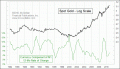
Is Gold Overvalued? |
Jan 21, 2011
Why Even Fundamental Analysts Should Watch A-D Line |