Death Cross Does Not Live Up To Its Hype
Free Chart In Focus email
Delivered to you every week
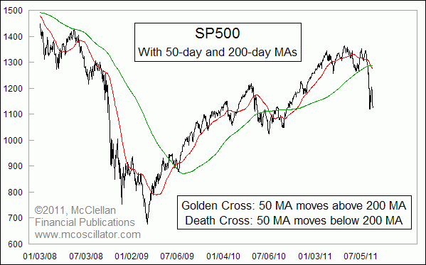
Chartists are all excited about the August 2011 "Death Cross" that appeared in charts of several market indices. This is an event where the 50-day simple moving average (50MA) crosses below the 200-day (200MA). It is also variously referred to as a "Dead Cross", but the meaning is the same.
The opposing condition is known as a "Golden Cross", which is when the 50MA crosses above the 200MA.
The idea behind this is that the two moving averages are sensitive to different length trends and cycles in price movements. The 50MA is more sensitive to price changes, and so when it crosses the longer moving average it is saying that a move is getting under way. Or perhaps more accurately, it is announcing that a move has already gotten under way, since it will lag the turns in prices.
I have to tip my hat to whoever came up with the jazzy names for these signals. They join others like the Miekka "Hindenburg Omen", the Ohama "Titanic Syndrome", the Zweig "Breadth Thrust", and others whose catchy names capture the public's attention. Dow Jones has even created an index based on switching in and out based on using a 50MA and 200MA crossover system.
And the Direxion family of ETFs has filed paperwork with regulators for a launch of the Direxion Large Cap Tactical Advantage Shares, which intend to shift asset allocations based on these moving average crossing signals for that Dow Jones index.
The Death Cross is clearly a concept which has captured the public's attention. In terms of being a great signal, though, Golden Crosses and Death Crosses do not have a stellar long term track record. The chart below shows a hypothetical equity curve if one had traded the SP500 based on these signals.
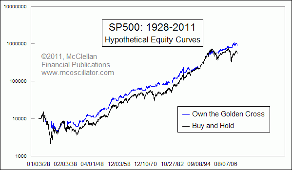
This study assumes that one could "own" the SP500 if its 50MA was above its 200MA, or exit out to cash if the opposite condition occurred, using the SP500 Index and Cowles Index data. This quick look is not meant to be a thorough analysis of an actual trading system, which would incorporate additional factors like transaction costs, dividends, interest on cash, and other factors which would affect actual returns. But creating a hypothetical equity curve like this is a good way to investigate whether there is really any merit to a trading signal one might be contemplating.
What this quick study shows is that trading the 50MA and 200MA crossovers does beat buy and hold for the 73 year period studied, but not by all that much. It softens some drawdowns, but misses efficient reentries.
Exiting on a Death Cross would have kept you out of the ugly declines in 1930-32, 1974, and 2008-09. So if you believe that you are in an environment where lengthy declines of more than 30% are going to be the order of the day, it can be helpful.
But someone trading based on these rules would have ridden down the 1987 crash, and then sold on Nov. 5, 1987. Reentry did not come until June 28, 1988, when the SP500 was already 9% higher than the exit point. Similarly, one would have ridden down the Flash Crash decline in 2010, and sold on July 2, 2010, the exact day of the bottom.
The August 2011 Death Cross may be another example of this very principle that Death Crosses quite often mark important bottoms. It takes lengthy and protracted declines in the market to make the exits profitable. Declines that arrive too quickly result in whipsaws, and missing out on the reentries until well after the rebound has started, which hurts system efficiency.
The point here is that we should not get drawn into the crowd behavior of getting all excited about the latest jazzy-sounding name for a technical phenomenon. Focusing just on the trend change aspect of a Death Cross signal can prevent us from seeing how it can do a good job of marking nice intermediate term bottoms.
Tom McClellan
Editor, The McClellan Market Report
Jul 15, 2011
Long Term Haurlan Index Divergence |
Jul 01, 2011
A Breadth Thrust Signal |
May 27, 2011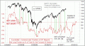
Commercial Traders Foretell Market’s Movements |
Mar 11, 2011
DJIA Price Oscillator |