DJIA Price Oscillator

Free Chart In Focus email
Delivered to you every week
The McClellan Price Oscillator is one of the more prominent indicators that factors into our analysis of various markets. It is calculated in the same way as the McClellan A-D Oscillator, except that instead of using the daily Advance-Decline difference as the raw input, we use the closing price or closing market index value.
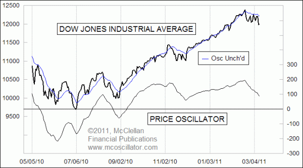
On that closing price data, we calculate two exponential moving averages that we call the 10% Trend and 5% Trend (AKA 19-day and 39-day EMAs). The difference between those two moving averages is the Price Oscillator. These moving averages are not included in this week's chart, because too many lines tend to clutter up a chart.
When the two moving averages are getting farther apart, the value of the Price Oscillator gets more positive or negative, depending on the relative value of each moving average. Generally speaking, when the Price Oscillator is rising, the presumed trend direction is upward. The strongest and most reliable uptrends tend to occur when the Price Oscillator is above zero and rising.
If the Price Oscillator is above zero and falling, it may be the start of a new downtrend, or it may just be a sign of a temporary pullback within a continuing uptrend. The most risk occurs when the Price Oscillator is below zero and falling.
Also included in this week's chart is an indicator we call the Price Oscillator Unchanged line. That line represents the closing value for the DJIA that would be needed in order to make the Price Oscillator go precisely sideways. If the DJIA is above that line, then the Price Oscillator moves upward. A close below that line takes the Price Oscillator lower. It is calculated by adding the value of the 10% Trend (19 EMA) to the value of the Price Oscillator.
As I write this, the DJIA's Price Oscillator is falling, but it has not yet gone negative. So we can still make the presumption that the price weakness since February is just a pullback and not a new downtrend. That presumption would be harder to support if the Price Oscillator crosses below zero.
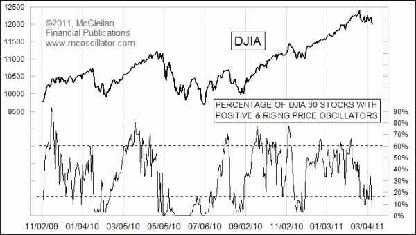
It is an interesting point that the DJIA's Price Oscillator can be doing one thing, but the individual Price Oscillators of the 30 DJIA component stocks can be doing entirely different behaviors. And we have found that there is useful information in those differences.
The chart below shows an indicator we developed years ago that looks at what is happening with all 30 of these stocks' Price Oscillators, and measures how many of them have a Price Oscillator that is above zero and rising.

The interesting point about this indicator is that by the time we see it move to a very high or very low level, the price trend for the overall market is about done. It takes a lot of energy for either the bulls or the bears to get everybody moving in one direction, and by the time you see all of the stocks' Price Oscillators behaving the same way, that energy has been expended. The current low reading in this indicator is suggestive of a bottoming condition for the market overall.
The daily values for both of these indicators are featured each day in our Daily Edition.
Tom McClellan
Editor, The McClellan Market Report
Jan 14, 2011
Bumpiness Is A Message |
Jun 18, 2010
All Time Record Low McClellan Oscillator |
Aug 21, 2009
Strong RASI Promises Higher Price Highs |