Eurodollar COT Throws a Curveball
Free Chart In Focus email
Delivered to you every week
This week I revisit one of my favorite indicators. But “favorite” does not mean perfect.
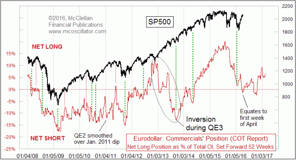
In 2010, I figured out that the net position of commercial traders of eurodollar futures gave a great leading indication for what stock prices would do a year later. Subsequent research showed that this has been going on since around 1997, which is when the eurodollar futures contract really started to come into prominence as a financial product. The only explanation I have for why it “works” is that somehow the big-money commercial traders of these interest rate futures products somehow are detecting and manifesting future liquidity flows that will affect stock prices a year later. Beyond that loose explanation, I cannot decipher the nuts and bolts of why this works.
I also cannot decipher why sometimes it does not work, other than to say that sometimes the Fed puts a thumb on the scale. The chart above shows that QE2 and QE3 disrupted the normally strong correlation.
That is an important lesson to remember, that a thumb on the scale can cause it to not work right. It is hard to tell in the long-term chart above, but we are now undergoing another of these periods of inversion, or at least disruption. So here is a shorter term view.
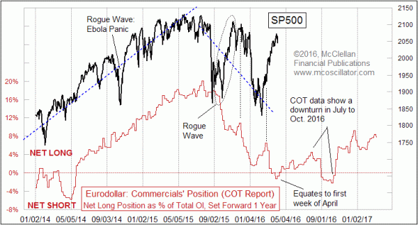
I was really looking forward for most of the past year to a nice strong decline, leading to a bottom due the first week of April. And from August 2015 to February 2016, it was working really well. But rather than dropping more in March 2016, the market continued its rebound. We appear to be seeing another inversion, with an apparent top arriving in early April instead of a bottom.
This time, we don’t have QE from the Fed to explain it. So what gives?
We do have QE from the European Central Bank (ECB). That’s a legitimate candidate for a “thumb on the scale”. So if the €12 billion per week of ECB QE is the real culprit, then it should show up in stock market performance which correlates to the ECB’s assets. Except that this is a cold trail.
Here is a comparison of the ECB balance sheet to the German DAX Index:
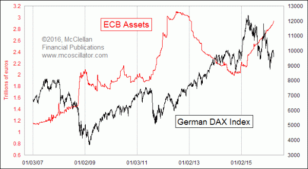
If anything, there seems to be an inverse correlation between the two, as if QE by the ECB does not even work, and may in fact do the opposite of helping stock prices and the economy.
I don’t know what the secret source of extra liquidity might be that is causing an inversion (or disruption) of the once-wonderful eurodollar COT leading indication. And I do not know for how long this inversion/disruption might last. For now, I can say that it goes to the analytical back burner, to be watched for signs of disinversion, but not to be trusted for now. If and when it ever goes back to working again, I’ll be sure to share that news with subscribers to our twice monthly newsletter and our Daily Edition.
For now, though, the early April bottom appears to be inverting to a top, and who knows what the call for another bottom in October means. So it is time to set this one aside until further notice.
Tom McClellan
Editor, The McClellan Market Report
Aug 21, 2015
Eurodollar COT Says Ugly Drop Is Still Ahead of Us |
Mar 10, 2016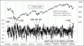
Highest McClellan Oscillator in 7 Years |
Dec 17, 2015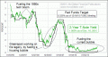
Fed Still Behind The Power Curve |