POMO: The Hot New Timing Tool
Free Chart In Focus email
Delivered to you every week
A lot of market analysts are getting excited about tracking the Fed's schedule of Permanent Open Market Operations (POMO). These are purchases of Treasury or other securities by the Fed in order to pump money into the system. The Fed also conducts Temporary Open Treasury Operations (TOTOs), which only involve very brief injections of liquidity that are then paid back a day or more later.
Looking back at history, other hyperinflationary regimes in the past (Weimar, Zimbabwe) have printed money and used it to pay salaries of government workers and to buy "stuff". But the Fed is sooo much more sophisticated. It does not print the actual money to conduct POMOs (although it does print plenty of money) but rather it makes adjustments to electronic balance sheets in order to purchase Treasury debt, and thereby put more "money" into the banking system.
Such efforts are stimulative to monetary liquidity because they increase the supply of money that is available to do things, such as bid up stock prices. When stocks are priced in dollars per share, if there are suddenly more dollars available, then more of them can be used to pay for the existing number of shares of stock. So share prices rise, and thus it is natural that stock investors should care about the Fed inflating the money supply this way.
Most recently, a lot of people are turning their attention to the actual days on which the Fed conducts POMOs. The Fed even lists a schedule of future POMOs, so traders can mark their calendars for when new money is coming into the pool. Upcoming POMO days are Nov. 1, 4, and 8, 2010.
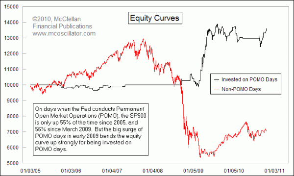
Zerohedge.com recently did some interesting analysis, looking at what would happen if you hypothetically "owned" the SP500 on days when the Fed conducted POMOs, and stayed out of the market on Non-POMO days. This week's Chart In Focus replicates one that Zerohedge created, using data from the Fed's own history of POMO transactions.
What this chart shows is the hypothetical equity curves if one had been invested in the SP500 just on the days when the Fed conducted a POMO, versus the equity curve for the rest of the time. It makes a pretty compelling case for the stimulative effects of POMOs on the stock market. And since the Fed tells us in advance when the POMO days are, how can we go wrong by buying ahead of the Fed's injections of liquidity?
Not so fast. A deeper examination of the data since 2005 shows that POMO days are actually up only 55.3% of the time. That's not much better than a coin toss, and effectively the same as the 54.5% of up closes out of all trading days over the same period. The equity curve is bent higher due to a very brief period in 2009 when POMO days coincided with big up days.
Trading system experts will tell you that a robust trading system will be one that works across a broad variety of time frames, and whose success is not tied to winning trades clustered into just one brief time period. If you look at the equity curve in times other than just that one brief period in 2009, the success rate does not seem so good.
But when we look at the following chart, portraying the dates and scales of POMOs, we can see that periods when the Fed is conducting these injections of liquidity seem to be good periods for the stock market, and the periods with no POMOs are rough times for investors. So it may not be the exact days of the POMOs, but rather the general periods when POMOs are happening.
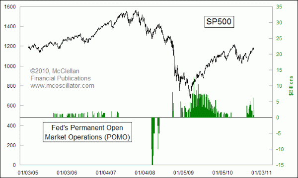
One of the points that jumps out of that chart is the big set of negative bars in the middle of 2008. Yes, friends, that is correct. In the middle of the greatest liquidity crisis in decades, the Fed actually drained reserves from the banking system in March through May 2008, when it seemed as though the crisis had been averted. The Fed sold $144 billion of Treasury instruments to pull out what the experts thought was too much liquidity in the banking system. 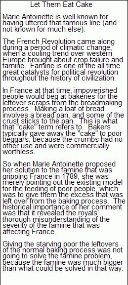
Aside from that one episode, the periods when there are positive bars do seem to coincide with a rising stock market. One big exception was the Fed's brief attempt to inject a small amount of liquidity in September 2008. This was the Fed's "Let them eat cake" moment. The experts thought that a nominal injection of liquidity would be sufficient to solve the banking crisis, and we all know how wrong that assumption was.
So with POMO periods appearing to correlate to a rising stock market, perhaps we need to change the focus from just looking at the days on which POMOs are conducted, and instead look at more expansive periods when they are underway. Since the money does not all flow out into the stock market in one day, perhaps a longer period of effectiveness for those money injections is the right way to think about how POMOs effect the stock market.
This next chart examines the hypothetical equity curves for investing in periods when there has been a POMO within the past week. In other words, it pretends to "own" the SP500 if there has been a POMO any time up to 4 days before, and stay out if there have not been any POMOs. We can see that this produces a much more favorable looking equity curve.
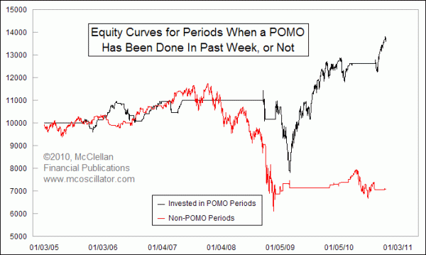
It had one big drawdown in the middle of the chart, related to the Fed's feeble attempt to do a little bit of liquidity injection in September 2008 and early 2009. Aside from that one episode, periods when the Fed has been doing POMOs do seem to offer an advantage to stock investors. So rather than focusing on just the calendar day of the action, pay attention to whether the Fed is doing them at all.
Tom McClellan
Editor, The McClellan Market Report
Jul 02, 2010
Liquidity Is Not The Problem |
Mar 12, 2010
FOMC Announcement Days Tend To Close Up |
Jan 08, 2010
The One Real Fundamental Factor Driving Gold Prices |