What Happened to the Presidential Cycle?
Free Chart In Focus email
Delivered to you every week
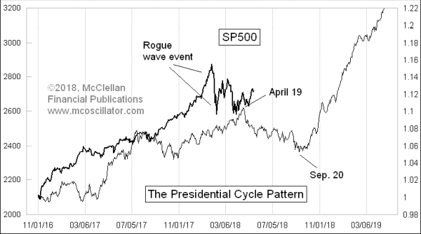
If this were a “normal” 2nd year of a presidential term, we would now be in a corrective period due to last until just before the mid-term elections. But as many in the press have noted, we do not have a “normal” presidency, and the market is not tracing out a perfect normal pattern.
Years ago, I first constructed a Presidential Cycle Pattern by averaging together multiple years’ worth of data on the SP500. One difference I chose to make in this process, versus the work of others, is that I started each year on the anniversary of the November federal elections.
The reason for that difference is that the investing public tends to react right away to the news of whoever gets elected, rather than waiting for January 1st, or January 20th when inauguration takes place. So we might as well accept the political annual cycle for what it is.
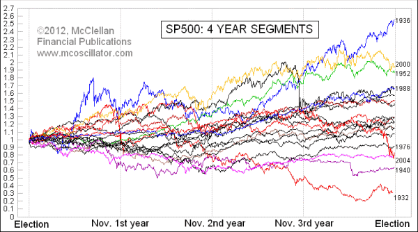
To come up with an “average” pattern of what the SP500 does over a 4-year presidential term, we have to first come up with a way to combine multiple different periods in an equitable way. Just averaging the SP500 numbers together would skew the data in favor of the higher numbered years, which are the most recent ones. So I did an intermediate mathematical step of chopping up the SP500 data into 4-year chunks of time, and then resetting their values to a percentage change from Nov. 1 of election years. That way each period gets a more equal weighting in the average pattern.
Here is what the adjusted raw data look like:
And when we average all of those wiggly lines together, we get the Presidential Cycle Pattern:
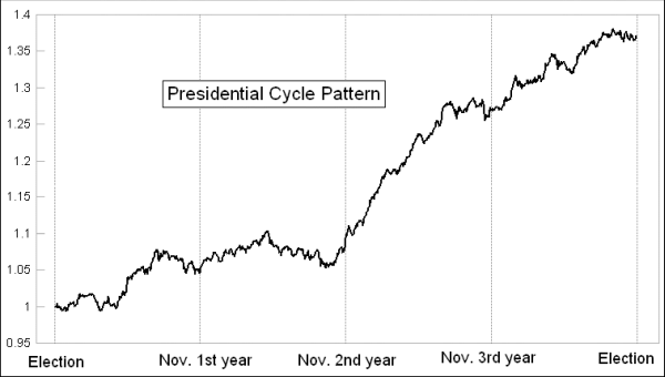
Seeing the average pattern this way, we find that the first 2 years of a presidential term are roughly flat on average. The 3rd year is a really bullish year, most of the time, and then the election year is generally up but a bit more iffy. So that’s how it all is supposed to go, on average.
Here, for example, is how that script played out in President Clinton’s first term, pretty much right on schedule:
.gif)
But as we see in the top chart way above, the stock market under President Trump has been quite strong in the first year, and is not matching the second year pattern exactly. The price top was in January instead of April. And the SP500 is now pushing to a slightly higher high in May, which is not what it is supposed to do.
We can run into trouble when we expect too much precision from the market about how it is supposed to follow our expectations, based on past behaviors. The stock market never follows the pattern exactly. But the spirit of the 2nd year of a presidential term is to enter a corrective mode, lasting until just before the mid-term elections. The market seems to be doing that.
The reason that this pattern unfolds this way has to do with the motivations of both politicians and investors surrounding the 4-year election cycle. When a new president gets elected, he (yes, so far, all have been “he”) typically spends the first 2 years “discovering” that things are even worse than he told us during the campaign, and then telling us that the “only solution” is whatever package of tax cuts/hikes and spending adjustments he is proposing that Congress undertake. Investors get bummed out hearing that things are even worse than believed, and so they tend to refrain from investing aggressively. That keeps the major indices flat, on average.
Then in years 3 and 4, a president typically tours the country declaring victory for all of the great things he did in the first 2 years, and asking us to reelect him (or his party’s successor candidate in the case of second term presidents). This is a repeating pattern, and it affects the pattern of how public mood waxes and wanes.
The worry in year 2 pertains to what might happen with the mid-term elections, when the party which holds the White House usually loses a few seats in congress. Sometimes those losses are enough to swing control of the House and/or the Senate, and so that creates a lot of risk about the unknown. The unknown is investors’ worst fear, and thus a maximization of unknown risks has a huge effect on investors’ moods, and thus on stock prices.
Interestingly, the average arrival point for the year 2 bottom is in late September, and not in November. The stock market seems to come to grips with how the mid-term election is going to turn out about a month and a half ahead of the actual election. The pundits don’t, and they keep arguing about it all the way until election night (and sometimes for long after). But the market usually gets over its worries by September in the 2nd year, and sets about commencing the 3rd year uptrend.
This time it is playing out a little bit off script, but still generally following the plan. Look for worries to accumulate about the mid-term elections as the summer runs on, and look for those worries to depress stock prices for a while. But then rest assured that the 3rd year effect lies ahead, and should help to lift stock prices months from now (but not now).
Tom McClellan
Editor, The McClellan Market Report
Jul 14, 2017
A Different Sort of Presidential Cycle |
Nov 05, 2010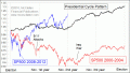
Entering the 3rd Presidential Year |
Mar 02, 2018
It’s the Fed, Yanking The Punchbowl |