Can Earnings Get Better Than This?
Free Chart In Focus email
Delivered to you every week
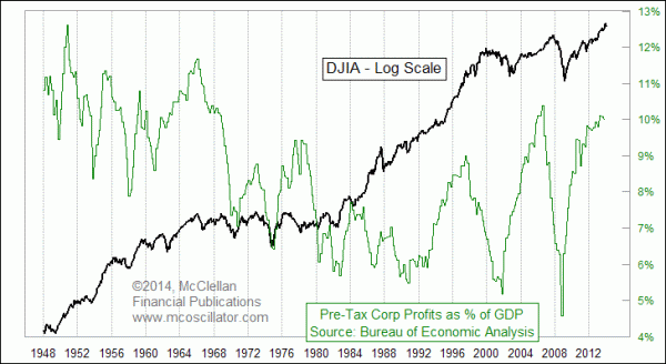
The conventional stock market analysis world revolves around earnings. "Earnings drive the stock market," they say. This myopic view is akin to the belief that carbon dioxide is the driving force behind the greenhouse effect (water vapor actually accounts for 90-95% of it, but you don't hear that). People believe that earnings are everything because they have been told that it is so, and everyone thinks so, therefore it must be so. Circularity of logic and contradictory evidence do not seem to be significant impediments to the acceptance of this belief system.
This week's chart looks at the BEA's data on corporate profits. To access it yourself, go to the BEA web site at this link, and then click on Section 1 - Domestic Product and Income, and then Table 1.10, and scroll down to Line 15. Then all you have to do is divide by GDP, which can be accessed here.
Why doesn't everyone look at earnings this way? My answer is that Wall Street has a fascination with its own forecasts of earnings, and with the reported earnings of listed companies stocks. But those are a pair biases which excluded private company earnings, and which also accept earnings estimates which are notoriously subject to revision. I prefer to deal in hard data. The next BEA report on earnings is not due out until Feb. 28, so using these data means accepting the inherent reporting lag.
What we see now is an indication that the reading for overall corporate profits as a percentage of GDP is at one of the highest levels of recent years. And when it cannot get higher, it can only get lower. It is true that this measure has been higher in the distant past, but that was back in the 1960s and earlier, when GDP was a bit different than it is now, and when accounting standards for measuring profits were also different. The current high reading has only been exceeded once in the past 46 years, and that was at the real estate bubble top for earnings back in 2006. And we all know how that ended.
Why should this matter? When profits get up too high, certain agents decide that "excessive" corporate profits are a worthy target to go after. So new taxes or other restrictive rules come into effect, and stimulative measures such as Federal Reserve policy which may help spur earnings to a higher level are pared back. Those twin agents have a negative effect on stock prices, or at least they have historically. Maybe this time will be different.
The other troubling point about this chart is that the amplitudes of the swings from highs to lows in corporate profits seem to be getting bigger over the past 20 years. This measure formerly had much smaller magnitude movements, but the big swings we have seen during the last 3 boom-bust cycles resemble a spinning top that is starting to wobble just before it falls over and stops. Yikes! And at the point when profits as a percentage of GDP starts to fall, you can see in the chart what usually is happening then to stock prices. But remember that there is a reporting lag; we don't even have Q4 numbers yet. So it is not as if you can wait for confirmation from the earnings data, and then decide how to invest.
Tom McClellan
Editor, The McClellan Market Report
Jan 23, 2014
Important Points About The Minimum Wage |
Nov 21, 2013
Perhaps The Only Chart That Matters (For Now) |
Jul 25, 2013
Is Shrinking Arctic Ice a Bad Thing? |