Is Shrinking Arctic Ice a Bad Thing?
Free Chart In Focus email
Delivered to you every week
There has been considerable alarm in recent years about the shrinking arctic ice cap. Some shippers look forward to actually using the "northwest passage" for shipping to cut off a few thousand miles versus going through the Panama Canal or around Africa, while others fear the rising sea levels associated with glacial melting. Polar bears who hunt for seals on polar ice have become the poster representatives of those who worry about ice caps melting.
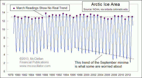
The lead chart above shows exactly the problem that has some climatologists worried. Polar ice area varies on a seasonal schedule, usually peaking with maximum area in March, and reaching its seasonal minimum in September. The last several summers have seen less and less ice area, which is the trend that has some worried.
But what is interesting is that this is not a phenomenon of generalized rising average temperatures. The summer minimum for ice area is shrinking, but the wintertime maximum has been remaining fairly steady. Usually the max is in March and the minimum is in September. So here are the plots of the ice area in just those two months, to help us see the difference in trends:
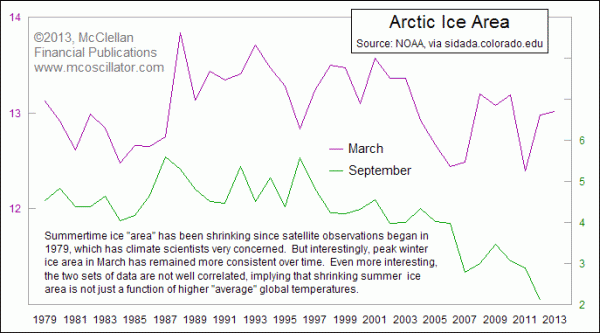
Those who are alarmed about arctic ice melting are focused on the summer minimum, and the recent literature usually ignores the March maximum ice area. This data on arctic ice area has profound implications for climate theory, and accordingly for policy decisions, but why should it matter to those of us concerned about the economy?
The answer lies in the variation that we see in the March ice area maximum. This is the pearl that can be found in these data on ice area. I have not heard anyone else talk about this, and I discovered it myself by digging into the data just because I was curious what it might show.
The ice area maximum that occurs typically in March is inversely correlated to economic activity. That's a big concept, so you should take a moment to let it sink in.
Putting it more simply, more wintertime arctic ice area is a bad thing for the economy. Less winter ice is good, at least from a GDP perspective.
To help us see that relationship, I have plotted a comparison of GDP growth to ice area in this next chart. The key point for understanding this chart is that the plot of arctic ice area has been inverted to better help see the relationship.

What this chart reveals is that more ice (i.e. a lower inverted plot reading) is associated with slower GDP growth. And shrinking winter ice area (higher inverted chart plot) is associated with faster GDP growth rates. The data are for annual GDP rates, and so while we already have the March 2013 arctic ice reading, we don't yet have the 2013 annual U.S. GDP growth rate value yet. But the fact that the March 2013 arctic ice area was greater (lower on the chart) than March 2012 implies a slower posting for 2013 U.S. GDP growth.
The correlation gets even better when we look at "world" GDP instead of just U.S. GDP:
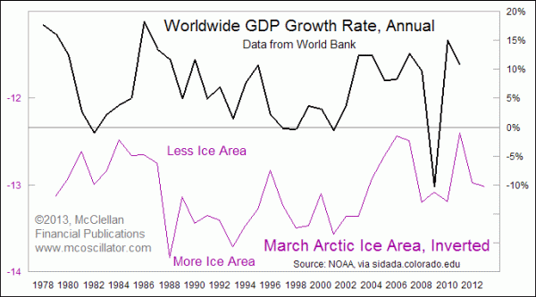
Once again the correlation is not perfect, but it is nevertheless clearly evident. More winter ice is bad for GDP growth, while less winter ice is associated with stronger world GDP data. The World Bank still has not yet published the GDP growth data for 2012, let alone 2013. The implication of this relationship is that the world GDP numbers yet to be published for 2012-13 should be somewhat disappointing, at least to those who like GDP growth. Those who like ice may have a different viewpoint.
The linkage between arctic ice area and GDP is likely agricultural in nature. Colder and longer winters that produce a larger maximum ice area tend to make things more difficult for farmers, potentially impacting nationwide or worldwide crop production.
So what is a market analyst to do, especially when concerned about the health of the planet and the human race? It is indeed a perplexing question. More global warming means more human suffering, we are told, resulting from presumably rising sea levels and greater assumed storminess. But that same global warming seems to mean greater GDP growth. So if one simultaneously roots for both cooler global temperatures and higher global GDP growth, the data suggest that those two objectives are at odds with each other.
So would the human suffering that would result from an economic slowdown (lower GDP growth) be perceived as being greater than the potential human suffering from presumably rising sea levels? That's not something these data can model. But it all does give one pause when considering the various claims about what continued arctic ice melting might mean, assuming that one pays attention to the actual data.
Tom McClellan
Editor, The McClellan Market Report
Apr 18, 2013
Copper Inventories Rising |
Nov 29, 2012
Why Increased Revenues Won’t Solve Fiscal Cliff |
Mar 16, 2012
In Order To Tame Inflation, Just Tame Uncle Sam |