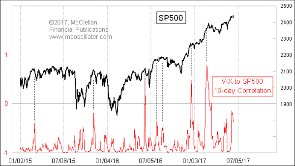
Correlation Between VIX and SP500
Free Chart In Focus email
Delivered to you every week
When the normally inverse correlation between the VIX Index and the SP500 gets crazy, if offers us a great message. That is the point behind this week’s chart, which is based on a great observation by Jesse Felder of www.TheFelderReport.com.
Jesse first wrote about it in a Tweet here back on March 3, 2017, and that same day it was featured in a MarketWatch article. I did my own investigation, which revealed that this is indeed a really cool insight.
What Jesse did, and what I have replicated here, is to calculate a 10-day Pearson’s Correlation Coefficient between the VIX and the SP500. You can do this incredibly easy in any spreadsheet program, or even more easily as Jesse did at www.stockcharts.com. Just call up a chart of $SPX, choose as your indicator “Correlation” from the list, and set “$VIX,10” in the parameters window. It is that easy. Then you can adjust the period under observation as you might wish.
What we see is that most of the time, the correlation hangs around down near -1.00, meaning that they have a strongly negative correlation. In other words, if the SP500 goes up, the VIX usually goes down, and vice versa. That’s what is normal. But the instances of abnormal behavior contain the really interesting information.
Here is a regression chart showing the one-day SP500 change versus the one-day VIX change:
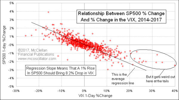
Each dot represents one day’s combination of the SP500 change and the VIX change. You can see that most of the dots line up close to the linear regression line, and that makes complete sense. It is not a perfectly inverse correlation, but it is a very strong one. Over this entire study period since January 2014, the correlation for their daily percentage changes is -0.83, which is pretty close to a perfectly inverse correlation.
But if you calculate the correlation coefficient using the raw VIX and SP500 indices rather than their daily changes, then the math is different. I don’t want to get too deep into the statistics, but I want to make the point that there are differences between running correlation analyses of the raw indices and those of their daily changes.
What’s more, real statisticians will tell you that Pearson’s Correlation Coefficient is the wrong statistical tool to use for a time series anyway. There are other more suitable tools for analyzing the strength of relationships between two contemporaneous time series. But they are a whole lot harder to use and to program, and so a lot of technicians just use what is easier. And sometimes what is easier can sometimes be good enough.
The chart of the 10-day correlation between VIX and SP500 is good enough to tell us when there is a moment of strange behavior between the two data sets. And those moments of strange behavior just happen to be pretty good at marking tops for stock prices. The higher that the Correlation Coefficient goes, especially when it gets above zero, the more important the message. And that usually means a more significant the price top. But meaningful tops can be found when the Correlation Coefficient gets up to a level shy of the zero line.
Ten days seems like a good period for this purpose, but others may work as well. Darshan Dorsey asserts that a 22-day correlation coefficient works even better.
On June 7, 2017, the 10-day correlation went up as far as -0.17. That was not quite to zero, but big price tops have been found on lesser readings. Usually the corrective mode suggested by one of these readings lasts until this 10-day correlation gets back down closer to -1.0, or perhaps longer. So there is still a lot of room for a correction to do its job from here before we can say that the correlation has returned to “normal”.
Tom McClellan
Editor, The McClellan Market Report
Aug 06, 2010
Correlations May Not Be What They Seem |
Feb 17, 2017
VIX Futures Traders Finally Getting Complacent |
Mar 23, 2016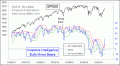
Too Fast of a Sentiment Swing |