Correlations May Not Be What They Seem
Free Chart In Focus email
Delivered to you every week
A lot of what technical analysts do deals with correlation. The idea of a divergence has to do with two things which move together, and then one of them does something different. Diversification is the idea of putting money into "non-correlated" asset classes. It is an important concept.
The simplest tool for quantifying correlation is known as Pearson's Correlation Coefficient. It expresses the quality of the correlation of two sets of data on a scale from -1.00 to +1.00. If you took two sets of data and arrayed them on a "scatter plot" chart, the correlation coefficient would tell you how linear the dots are. But using correlation coefficients can get an analyst into trouble if one only looks at the number, and with this week's chart I want to give you a great example of why this is a problem.
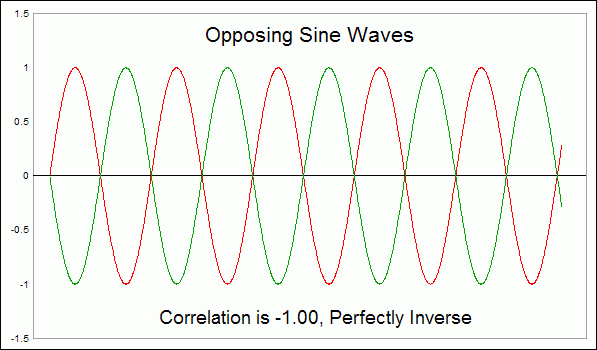
The top chart this week shows two sets of data which are perfectly inversely correlated. I know this because I calculated a sine wave in a spreadsheet, and then created a second column which was just the same number with the plus or minus sign reversed. The correlation coefficient for these two sets of data is -1.00, meaning that it is a perfectly inverse correlation.
But if we add an upward slope to these two same series of data, then everything changes. The second chart shows the same two sine waves used in the first chart, but I have added an upward slope.
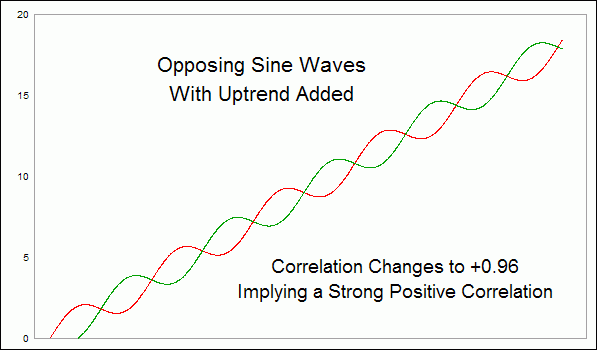
Now, the correlation coefficient flips around to +0.96, meaning that they have a nearly perfect positive correlation. Even though the two are still moving in opposition to each other, the calculation implies that they are positively correlated.
This happens because of a principle known as "autocorrelation", which is a word that has different meanings when used in different fields of statistical study. Here, I am using it to refer to the effect of increasing the correlation coefficient of two inverse sets of data by sloping them upward. The same effect could be achieved by sloping them downward together.
And here is a great example of why this principle is important for technicians. Below is a price pattern analog that has been watched for years by a lot of analysts. I wrote about this recently in a prior Chart In Focus article. It involves a comparison of the current price plot of the Nasdaq Composite against the history of Japan's Nikkei 225 Index. The point of the alignment is the Internet bubble top in 2000 versus the Nikkei's peak in 1989.
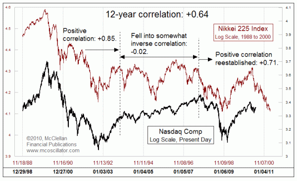
The overall correlation coefficient for the 12 year history shown here is +0.64, which is a pretty strong positive correlation. But when we look more closely at the two plots, we can find significant periods when correlation seems to go away. For the first third of the chart, the correlation was much stronger, at +0.85. But in the middle of this study period, it drops to approximately zero. Within that middle period, there appear to be price movements which are almost perfectly inverse.
In the final third of the chart, the positive correlation seems to be reestablished, with a coefficient of +0.71.
The key point to take from this is that correlation can be a somewhat variable attribute, and the fact that a correlation seems to exist over a long period does not necessarily mean anything about what happens to the data for shorter periods within that long period.
It may not be apparent from a visual inspection of this chart, but the two patterns right now are showing signs of inversion once again. For the past 2 months ending August 6, the correlation coefficient is -0.21. That is not a very good track record on which to base daily trading decisions.
So be careful next time someone offers you a correlation coefficient in order to prove a point. Like most statistics, correlation coefficients can often show you things that are not really there.
Tom McClellan
Editor, The McClellan Market Report
Jul 30, 2010
Not the Great Depression, But an Interesting Facsimile |
May 28, 2010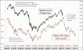
Nikkei-Nasdaq Analog Update |
Oct 23, 2009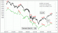
An Interesting Divergence |