Not the Great Depression, But an Interesting Facsimile
Free Chart In Focus email
Delivered to you every week
It has been over-reported in the press that the current economic slowdown is the "worst since the Great Depression". In the first place, that's not true; conditions were worse in the early 1980s, when unemployment reached 10.7%. Conditions were also worse just after World War II, when weapons and munitions factories were shut down, and when inflation jumped 20%. It is just that the Department of Labor did not start keeping statistics on unemployment until 1948, so reliable statistics about unemployment after WWII are not available.
And in the second place, it does a disservice to history if the reporters of today can only recall the Great Depression, and not the multitude of other periods of economic difficulty.
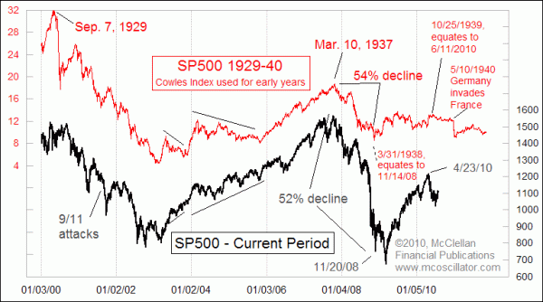
But the stock market has an interesting point to make about the comparison to the Great Depression. This week's chart looks at the SP500 then versus now, and the point of alignment is the top in 1929 with the top of the Internet bubble in 2000. What we discover when viewing this comparison is that the duration of the decline to the bottom in 1932 matches the duration of the decline to the bottom in 2003.
The uptrend out of that March 11, 2003 bottom lasted until October 9, 2007, a time span of 55 months. A similar 56 month time span is seen in the uptrend from the July 1932 bottom to the March 1937 top.
Now here is the amazing part of this story: The 1937-38 bear market saw a 54% decline, and lasted just over a year. And the 2007-08 bear market saw a 52% decline to the November 20, 2008 bottom, and lasted just a little over a year from the 2007 top. The one big difference was that the most recent bear market decided to make an extra dip into March 2009 before starting upward, but it has since remained on schedule.
Now, here comes the problem. In the late 1930s, European countries were starting to fall one or a few at a time to the advancing Nazi army, and investors in the U.S. were understandably worried about the effects on the economy, not to mention the effects on the people involved. Germany invaded Poland on September 1, 1939, but the stock market continued upward in part because of a U.S. declaration of neutrality. Stocks reached a peak on October 25, 1939, less than 2 months after Germany's invasion of Poland, because it was becoming clear that staying neutral was not a policy which would last very long.
That October 1939 top would have meant a top in June 2010, if the current market were following the schedule exactly. Instead, stocks topped April 23, 2010, but that is still pretty close. The reason for the May-June 2010 decline, however, was far different than worries over looming war in Europe. In fact, the entire economic situation now is arguably far different from what investors faced in the 1930s.
So why do we have such similar looking stock market behavior?
We like to think we understand the forces that move the economy, and the stock market. But when such seemingly different forces can result in similar looking price behavior, it is a message that we may not understand the real forces moving the market at all.
I am personally hopeful that we will not see a market-moving event that is the equivalent of the invasion of France in May 1940, and indeed that dip in the 1940 pattern should best be considered an exogenous event like the 9/11 attacks, which were not part of the script. My expectation is that at some point the two patterns will grow increasingly dissimilar in their appearance. Every price pattern analog I have studied has eventually seen the correlation break up, and this one should too.
Tom McClellan
Editor, The McClellan Market Report
May 28, 2010
Nikkei-Nasdaq Analog Update |
Jan 15, 2010
Stock Market Repeating the Sideways 70s |