Election Year Differences
Free Chart In Focus email
Delivered to you every week
One of our favorite cycle tools for many years is the Presidential Cycle Pattern. I first started writing about this topic back in 1994, and have used it extensively for both macro and micro analysis in our newsletter and our Daily Edition.
The basic idea is that there is a relationship between the political calendar and the movements of the stock market. Since the U.S. has a regular 4-year election cycle dictated by the Constitution, we can examine the behavior of each four year period to find similarities and differences.
I do this by taking the SP500 data and chopping it up into 4-year chunks of time. I prefer to use Nov. 1 of election years as the start point rather than January 1, since the market tends to react to whoever gets elected as soon as the results are known. Usually that is right away (the hanging chads episode of 2000 was a rare exception).
To average together multiple 4-year blocks of time, I first reset the start date to a value of 1.0, and then express all subsequent days' prices as a percentage change from that initial date. That way the different index levels can be more accurately averaged together without the higher numbered years skewing the average.
In addition to averaging all years' data together, we can also do different types of studies, such as comparing Republican to Democrat presidential terms. Interestingly, before 1992 there was not much difference between those versions in terms of overall performance, but the bull market of the 1990s bent the Democratic Presidential Cycle Pattern much higher.
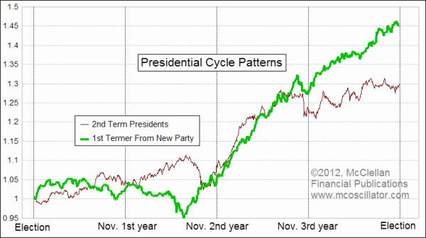
This week's chart looks at the difference in the SP500's performance when there is a 1st term president in office from a different party than the prior term, like we have now with President Obama. For comparison, the other pattern looks at the SP500's typical performance when the president is in his second term, or when a new president of the same party is in office. An example of that latter category would be President Truman following President Roosevelt, or President George H. W. Bush (41) following President Reagan.
The reason for drawing a distinction this way has to do with the tendency exhibited by nearly all 1st term presidents of a different party than the prior president. As a rule, they all typically spend the first year in office "discovering" that conditions are even worse than we were told during the campaign, and that the "only solution" is some urgent package of tax changes, spending, regulations, etc.
When President Clinton took office in 1993, he declared that we were in "the worst recession in 50 years", and that the "only solution" was his proposed package of $20 billion of stimulus spending. Ahhh, $20 billion... what a quaint little number. It was almost the same when President Bush took office in 2001, encountering a "severe recession", and proposing tax cuts as the remedy. When President Obama arrived in 2009, it was a $787 billion stimulus package. For President Reagan, it was the famous "Kemp-Roth Tax Cut" signed in August 1981.
When a first term president wins reelection to a second term, then he typically does not spend much time in the first year telling us all about what a lousy job his predecessor did. That lack of a persistent negative message seems to work out to bring slightly better market performance right after a reelection.
But with a new president from a different party, investors tend to get discouraged hearing that things are worse than expected, and so the market's performance during the first few months with a new party president is on average slightly worse than if an incumbent wins reelection. Over time, though, it tends to average out to be just about the same. The chart shows that there is a bit of a difference during the second year, which is often when major legislation is up for consideration (such as President Obama's health care bill, for example). But then in the 3rd year, the two patterns are back together nearly in lock-step.
That all changes in a really significant way during the 4th year, which is the election year. The average pattern for 1st term presidents does much better in the election year than for second termers. We can theorize about why that might be, but my hypothesis is that investors fear the unknown, and in an election between two new candidates you are guaranteed to get an unknown new guy. With a 1st termer running for reelection, there is at least the possibility of the market getting a result that it is familiar with, so investors feel better and buy accordingly.
We have seen this all play out multiple times before. 1960 was President Eisenhower's last year, and it saw a weak market. So did 2000, which was President Clinton's last year, at the end of the tech bubble. 2008 was President Bush's last year, and we all know what a weak year that was for the stock market.
That's not the situation we face now in 2012, with President Obama running for reelection and unsurprisingly doing his best to put a good spin on what is happening in the economy and the country overall. This is once again all pretty typical.
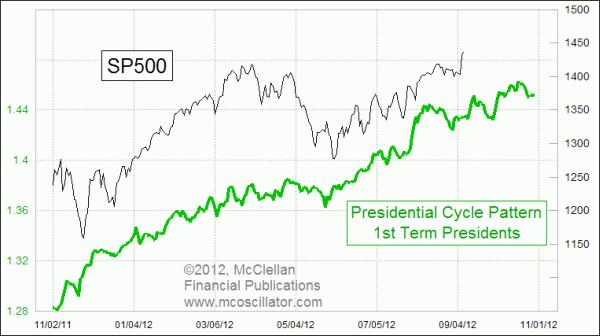
We can see in the next chart that the current performance of the SP500 looks a lot like the typical performance during an election year with a 1st term president running for reelection. The minor movements of the SP500 seem to be arriving about 2-3 trading days late versus what the pattern says, but that small lag is at least consistent over time.
Looking ahead, this version of the Presidential Cycle Pattern says that we should expect to see a choppy uptrend continuing toward election day, perhaps with some significant "texture" along the way. The strong correlation up until now suggests that this pattern is working reliably. Once we see how the election turns out, we can then figure out which pattern to follow starting in November.
Tom McClellan
Editor, The McClellan Market Report
Nov 05, 2010
Entering the 3rd Presidential Year |
Apr 16, 2010
Presidential Cycle Shows April Top |
Jul 13, 2012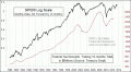
Stock Market Says We Can’t Solve Budget Problems With Taxes Alone |