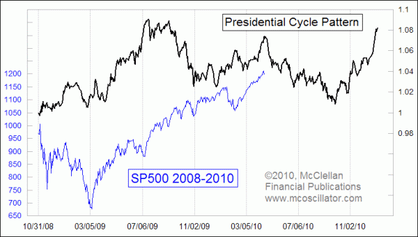
Presidential Cycle Shows April Top
Free Chart In Focus email
Delivered to you every week
The stock market's big one-day drop on April 16, 2010 comes at an interesting time on the calendar. The news which sparked the selloff was that the SEC is alleging wrongdoing by the investment banking firm Goldman Sachs in the construction of a collateralized debt obligation (CDO) product that it marketed. Without going into the specifics of that charge, it is fair to say that political factors may be involved in the timing of that announcement, since major financial regulation legislation is currently being considered by Congress.
It is no surprise that the political calendar in Washington, DC has some influence on stock prices. In order to try and measure that effect over time, one of the tools I like to use is our Presidential Cycle Pattern. I first created this indicator back in 1994, as a way of depicting the effects of the political calendar that had previously been described by Yale Hirsch and others.
They had noticed that the first two years of a presidential term had a tendency to be flat on average. The third year is nearly always an up year (1931 and 1939 were notable exceptions), and the election year is usually up although not as strongly as the third year. To depict that graphically, I created the Presidential Cycle Pattern (PCP) to portray the market's average performance at every point over a four year presidential term.
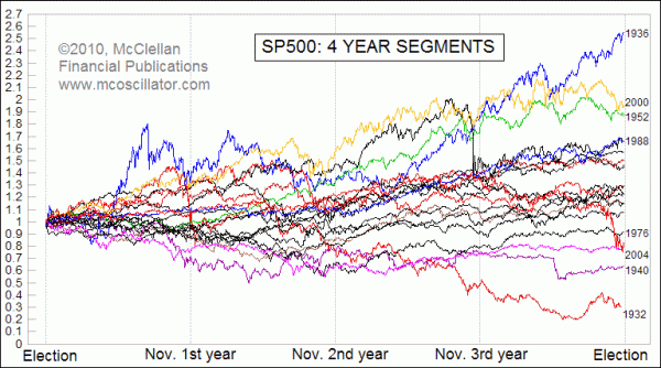
To do this, I chopped up data for the SP500 into 4-year chunks, each starting on November 1st of the election year to correspond as closely as possible to the presidential election day. The markets typically respond to the election as soon as it is over, as opposed to waiting for inauguration day to react to a new president, so the Nov. 1 start date makes more sense.
Each period's price history for the SP500 was then reset to a starting value of 1.00, with subsequent values reflecting the percentage change since the start date. Then all of the periods are averaged together to get the Presidential Cycle Pattern.
On average, the stock market sees a top in April of the second year of a presidential term, and heads downward toward the November mid-term elections. In reality, there is quite a bit of variation, since the Presidential Cycle Pattern is an average of past behavior. Some periods saw better performance, some worse. The reasoning for an April top in the second year may have to do with Congress trying to get some difficult legislative activity out of the way so that members can all go back home in the summer to campaign for reelection.
Wall Street typically does not like ambitious activity from Congress or the executive branch. For more on this topic, see Attention From Washington.
Turning our attention back to the top chart above, the correlation of the SP500 to the Presidential Cycle Pattern (PCP) during President Obama's tenure has not been perfect, but there have been some interesting turning points for the SP500 that have coincided with turning points in the PCP. And the general trend of the market has been upward since March 2009, which agrees with the general uptrend of the PCP.
Seeing a turn downward in April of the second year on news of federal attention fits well with the political calendar effects that seem to drive the shape of the PCP. This does not preclude the stock market from going on to make higher highs sometime this summer, and indeed the still-high Summation Index level implies that the uptrend is not done yet. So does the historical pattern analog between the Nikkei 225 Index and the Nasdaq Comp shown in the link below.
But to make those potential higher price highs, the stock market is now going to have to fight against its normal tendency to trend downward during the spring and summer of the second year of a presidential term. The still strong breadth numbers will provide some ammunition for that fight, but increasing mudslinging in Washington as the mid-term elections draw closer may mitigate those positive effects.
Tom McClellan
Editor, The McClellan Market Report
Sep 18, 2009
Old Nikkei 225 Chart Pattern Has Story To Tell For Today |
Mar 05, 2010
NYSE’s New Highs Confirm Uptrend |
Oct 30, 2009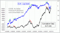
A-D Line Back Near All-Time Highs |