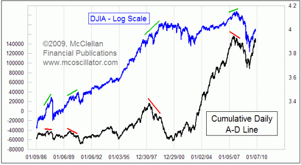
A-D Line Back Near All-Time Highs
Free Chart In Focus email
Delivered to you every week
While most major stock market indices are still a long way from getting back to their 2007 highs, the NYSE Advance-Decline Line is almost there. Having the A-D Line be stronger than prices is actually really good news for the bullish case.
The reason why it works this way is that the A-D Line is the best indicator of strong or weak liquidity. It can only go up when a majority of stocks are going up day by day, and that can only happen when there is enough money to flow into a majority of stocks.
If liquidity becomes constrained, it is still possible for the major averages to move higher if the available money is effectively channeled into the right stocks. We saw a great example of this from 1998 to 2000, near the center of the chart. The A-D Line made its high in April 1998 and started downward at a pretty steep rate. The DJIA and other indices continued upward (interrupted briefly by a 20% decline in August 1998) toward highs in 2000, as traders got excited about the Internet bubble and how "it's different this time". The A-D Line was correctly saying that there really was a liquidity problem, and that very problem eventually came around and bit even the best and brightest stocks.
We also saw a really weak A-D Line in 2007 and 2008, which correctly told us that there was a liquidity problem as the housing bubble collapsed and as the Fed did not respond quickly enough. The A-D Line reached its all-time high on June 4, 2007, more than four months ahead of the all-time high for the DJIA. The divergence in 2007 correctly told us that there were significant liquidity problems then, which took a long time to work out.
Liquidity is not the problem right now. The very steep rise since March 2009 by the A-D Line says that there is a lot of money out there trying to fit itself through the door of the stock market. It is so much money that it cannot fit itself into just the most deserving issues, and instead is flowing to the broad list of stocks just to find enough places to go.
The market can still stumble and correct even during a strong bull market, and so we should not assume that the steep rise in the A-D Line creates an immunity from all risk. Indeed, in the most recent issue of our twice monthly McClellan Market Report newsletter, we make the case for a cyclical correction leading to an important bottom in December 2009, after which the liquidity shown by the strong A-D Line should reassert itself.
Tom McClellan
Editor, The McClellan Market Report
Jan 01, 2010 Nasdaq A-D Line “Divergence” |
Oct 16, 2009 A-D Line Has the Story on Corporate Profits |
Nov 20, 2009 NDX A-D Oscillator |