Eurodollar COT’s Leading Indication
Free Chart In Focus email
Delivered to you every week
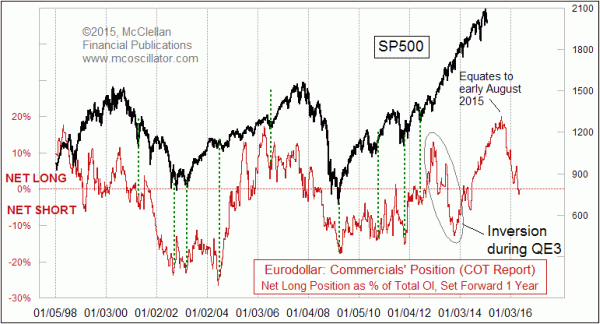
The second half of 2015 could be a problematic time for the US stock market, if this week’s chart is correct. I introduced this relationship to Chart In Focus readers back in 2011, and it has been a regular feature in our twice monthly McClellan Market Report and our Daily Edition since 2010.
The basic idea is that I take data from the weekly Commitment of Traders (COT) Report on the commercial traders’ net position in eurodollar futures, and then use that as a leading indication for the SP500. In this case, the term “eurodollar” (ED) refers not to a currency relationship, but rather to dollar-denominated time deposits in European banks. So it is an interest rate futures product.
The commercial traders are the big money firms, and thus they are presumed to be the smart money. At any given time, some of them will be holding long positions and some holding short positions, so this chart portrays their net position, or the difference between their longs and shorts. I also prefer to express it as a percentage of total open interest, rather than just using the raw numbers.
I do not know why it works to have the ED COT data shifted forward by a year to see what the SP500 will do. But after seeing that it has worked for several years, at some point we stop wondering about the “why” question, and start to accept that there really is something working here.
I should emphasize that the relationship broke down during the Fed’s QE3, the $85 billion per month program of expanding the Fed’s balance sheet which started in September 2012 and then tapered down to nothing by October 2014. During 2013 the once-nice leading indication seemed to be inverted for a while, and then the two plots got back into sync again starting in late 2013. That was a frustrating time since I had come to trust its message so much when it was working well in 2011 and 2012.
That just proves the point that no indicator is infallible, and one must continue to pay close attention to what is going on, just to make sure that everything is working as it is supposed to.
With the relationship back in sync now, it is appropriate to look ahead to a top due this summer, and some ugliness for stock prices this fall. Ideally the top is due in early August, but there can be slight differences in the texture of the ED COT pattern and the actual behavior of the SP500.
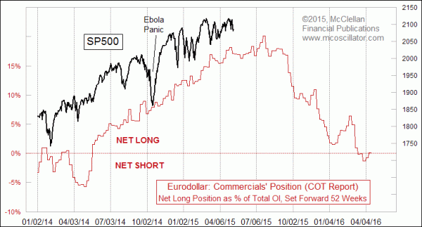
The Ebola Panic in October 2014 was a great example of how an exogenous event can appear and disrupt the price pattern. But there is also a great lesson there, because once the panic ended, the market worked extra hard to get itself back on track. The Ebola Panic was not part of the script, much like Eisenhower’s heart attack, or the 9-11 attacks, or other exogenous events that temporarily rock the market.
The steep downward slope of the ED COT plot suggests a pretty meaningful decline late in 2015. I try to stay away from converting such things into a price objective. I figure that if I get the direction right, the magnitude will take care of itself. One risk factor, however, is that the ECB’s own QE program of €60 billion euros per month could disrupt the correlation much like QE3 did in 2013. We are not seeing any sign of that disruption right now, but it is something to pay attention to.
The last point is that the idea of a meaningful decline in 2015 goes against the idea that the 3rd year of a presidential term is supposed to always be an up year. And it always has been for the last few decades, but there can still be some dramatic declines in the 3rd year. 2011 saw a meaningful price drop after the end of QE2. 1999 had a pretty dramatic drop late in that year, but that did not interrupt the Internet Bubble all that much. 1987 was among the most memorable of the 3rd year drops, and most notably it still was an up year. So a decline assuredly is possible, and if the Federal Reserve does decide to start raising rates later this year, that could exacerbate the severity of the decline.
Tom McClellan
Editor, The McClellan Market Report
May 27, 2011
Commercial Traders Foretell Market’s Movements |
May 08, 2014
Fed Funds COT: A Fun Leading Indicator |
Feb 26, 2010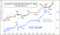
Oil’s Leading Indication for Stocks |