Oil’s Leading Indication for Stocks

Free Chart In Focus email
Delivered to you every week
Last week, we looked at the leading indication given by "real" yields, foretelling what the Dollar Index should do months later. We call this sort of phenomenon "Liquidity Waves", referring to the way that a wave of liquidity moves from one market to the next in sequence, and causes similar behaviors as it passes through each market.
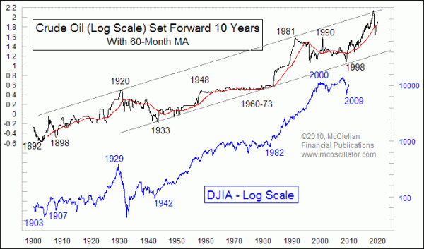
This week's chart shows another interesting Liquidity Wave relationship. Here we take a really long term look at crude oil prices and the DJIA. The oil price plot is shifted forward in the chart by 10 years to reveal how oil's price movements are seen again a decade later in the DJIA.
I don't have a good hypothesis to explain why it should work this way, which is a little bit troubling, but then I don't have a complete explanation for the precise amount of time lag seen in other price relationships. I just see the very good correlation in their price patterns, and figure that there must be a relationship there in order for such a strong correlation to persist for such a long time. It may not even be a cause and effect relationship, where rising oil prices cause the DJIA to rise a decade later. They may just be symptoms of some other unseen cause that works on each market.
Even without understanding the reason why it works, it is fascinating to see this relationship, and ponder its implications for the future. Before going there, I should note that it has not always worked perfectly. The big run up to the 1981 top in oil prices was not quite matched by the DJIA, but remember the oil market in the 1970s was dominated by the restrictive efforts of OPEC. Anytime that a government or quasi-governmental agency puts its thumb on the scale, prices are likely to get skewed.
The March 2009 bottom for the stock market was a great example of an echo of past behavior in the oil market, coming 10 years and 5 months after the November 1998 bottom in oil prices. So far, the rebound in stock prices is matching the rebound seen in oil prices during 1999.
The real question is whether the DJIA can match the strong uptrend in oil prices during the decade of the 2000s, a bull market which took oil all the way back up to the top of its parallel trend channel. Those channel lines, by the way, equate to a 4.26% compound annual growth rate for oil prices. Seeing an up move in the stock market that is equivalent to the huge up move in oil over the past decade would conflict with some of my other long term projections, especially considering that the retiring baby boomers will be starting to pull money out of investments instead of putting money into the stock market. One possibility is that the Fed won't be able to tame inflation, and we then have to add a zero to all of our stock prices to account for hyperinflation. Or we could see an up move in the DJIA that matches the timing but not the magnitude of oil's run.
We've covered just a few examples of Liquidity Waves here in these Chart In Focus articles. Our Liquidity Waves seminar DVD dives into more of these fascninating phenomena.
Tom McClellan
Editor, The McClellan Market Report
Feb 12, 2010
Birth Rate and the Stock Market |
Jan 15, 2010
Stock Market Repeating the Sideways 70s |
Nov 06, 2009
Civilian Employment Level (Follow Up) |
Dec 11, 2009
Final Dip Coming For Housing Market |