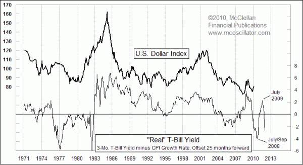
Real Yields and the Dollar
Free Chart In Focus email
Delivered to you every week
Back on January 8, we examined a comparison between the "real" yield on Treasury Bills and the price of gold. The point of that comparison was to show that negative real yields tend to be enormously stimulative to gold prices, because the "opportunity cost" of missing out on interest payments while investing in gold is less than the inflation rate.
This week's chart again looks at that real yield plot, but with perhaps a more interesting relationship. In this chart, we see one of the "Liquidity Wave" phenomena that shows up in so many different price relationships, where one set of data leads another and the same dance steps are repeated after a lag period. Understanding these Liquidity Wave relationships is one of the best ways I know to model future price movements.
What this chart reveals is that the movements of the real T-Bill yield are repeated just over 2 years later in the Dollar Index. This is a profound revelation. Rising interest rates are thought to be helpful to the dollar, and they seem to be at least for short periods in real time when rate changes are announced by the Federal Reserve, but this chart reveals that the truly significant changes in the value of the dollar over time follow interest rates with a 2 year lag.
It is not a perfect leading relationship, and in fact no Liquidity Wave relationship that I have ever studied has been perfect. These are complex markets where perfection does not exist. But having an idea about what is supposed to happen can be a really useful edge.
Beginning in November 2009, we have seen a dollar rally that seems pretty big on a daily bar chart, until we see how it compares to past rallies on this monthly chart spanning several years. It looks pretty puny compared to some of the big moves of past years. More importantly, the early 2010 blip upward by the Dollar Index is not happening according to the script suggested by the real T-Bill yield, which says the Dollar Index is supposed to be declining right now. That decline in the real yield 2 years ago bottomed in July and September 2008, so a perfect 25 month lag would mean a Dollar Index bottom in August to October.
We probably won't see perfection in the way that the Dollar Index follows this leading indication, but we should still expect a lower low. After a dollar bottom sometime later this year, we should get to see a more meaningful dollar rally into 2011, followed by another dip to match the current negative real T-Bill yields.
The ironic aspect of this relationship is that the movements of the dollar have a big effect on gold prices, and so the real yield that provides a real-time influence on gold prices also provides a leading indication for the dollar, which itself affects gold prices. How something can matter now, and simultaneously matter 25 months later, is one of the marvels of market physics.
Curious about other Liquidity Waves?
- Inflation and Unemployment
- Lumber and Home Sales
- Yield Curve and Small Caps
- Stock Market and Employment
 Our Liquidity Waves DVD covers these and more hidden relationships where one market or price indicator leads another. This 2 hour seminar teaches you how to track liquidity as it moves through different financial markets. Check out our Books and DVD page.
Tom McClellan
Editor, The McClellan Market Report
Dec 11, 2009
Final Dip Coming For Housing Market |
Nov 06, 2009
Civilian Employment Level (Follow Up) |
Sep 04, 2009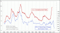
Unemployment Rate Rising On Schedule |
Sep 25, 2009
What Good Is The Yield Curve? |