Fed Sloshing The Liquidity Pool
Free Chart In Focus email
Delivered to you every week
The Fed's Permanent Open Market Operations (POMOs) have a bigger effect on pushing stock prices up and down than most people would like to believe. The financial media like to convince us that what moves the market up and down are earnings news, employment reports, or concerns about Greek debt. But this week's charts reveal that the Fed's thumb on the scale has a big effect.
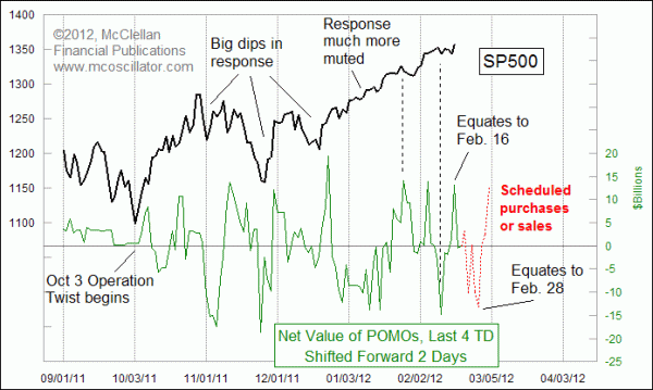
The New York Federal Reserve Bank is the agency conducting these POMOs on behalf of the Federal Reserve, and the NY Fed kindly publishes a lot of data about them. They even give us a schedule of intended operations up to a month ahead of time, telling us the dates and projected amounts of the purchases and sales that they will be doing as part of Operation Twist. That lets us have a road map for when those actions will have an effect on stock prices, and this chart is one that we have shared frequently with readers of our Daily Edition.
Most investors remember the Fed's efforts to pump money into the banking system following the 2008 market debacle. The first round of "quantitative easing", or QE, ended in April 2010 and was quickly followed by the illiquidity event in May 2010 that came to be known as the Flash Crash. The Fed quickly geared up for another program of purchases that came to be known as QE2, which was a big hit for the stock market right up until it ended on June 30, 2011. The end of that program was followed pretty quickly by the ugly decline in July and August 2011.
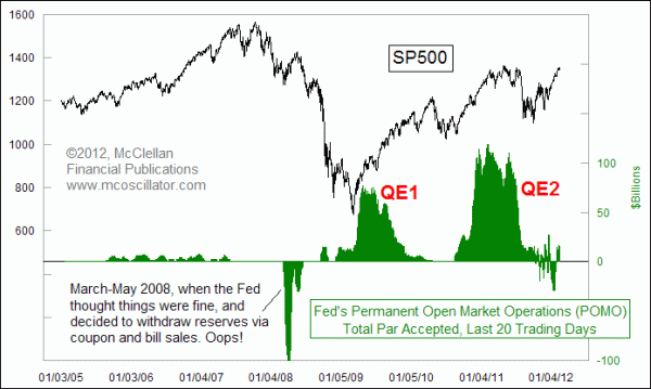
 During QE1 and QE2, all of the POMOs were purchases of Treasury and agency debt, pushing money into the banking system and taking debt instruments out of the hands of the banks. That extra money went to work by pushing up stock prices, at least for as long as the additional money was flowing into the banking system. At the ends of each of those rounds of QE, the market responded like a heroin addict going through withdrawal. But rather than go back to the same well one more time with a QE3, the Fed decided in September 2011 to implement Operation Twist, which is an effort to change the shape of the Treasury yield curve by purchasing longer term debt and selling short term paper.
The amounts are supposed to offset each other, but the problem is that the purchases and sales are done on different days. This lumpiness of the Fed's activities shows up in the stock market's price movements, as this week's lead chart illustrates. The effect of these actions on stock prices has become a lot more muted lately, compared to the wider swings associated with POMOs back in November and December 2011. It has helped, I suppose, that the positive liquidity effects revealed by the eurodollar COT leading indication have smoothed over the ripples in the liquidity stream.
But now we are entering into a period when that leading indication says things should get a little bit rockier. And the POMO schedule says that some big sales are coming up, events which will take money out of the banking system. We can only see out as far as the end of February with this indicator, because that is as far ahead as the NY Fed has announced its planned operations. I'll be checking the new operations schedule when it comes out on Feb. 29, and will share with our subscribers what the new road map looks like.
Tom McClellan
Editor, The McClellan Market Report
Oct 29, 2010
POMO: The Hot New Timing Tool |
Feb 03, 2012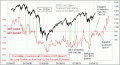
Eurodollar COT Indication Calls For Big Stock Market Top Now |
Jan 13, 2012
RASI Above +500 Says Bull Market Not Done |