RASI Above +500 Says Bull Market Not Done

Free Chart In Focus email
Delivered to you every week
The Ratio Adjusted Summation Index (RASI) is back up above +500, and that is a bullish piece of news. It takes a sustained period of positive breadth numbers to achieve this, and I like to say that gobs of positive breadth is almost always a good thing.
The Ratio Adjusted Summation Index is much like the classic version, with one difference. We factor out the changing number of issues on the NYSE in order to make long term historical comparisons more meaningful. You can see the whole calculation method here.
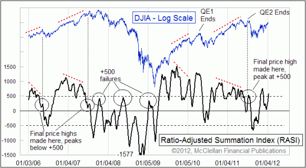
Like the classic Summation Index, the RASI moves up and down with the trend of the market, and it gives important information about the state of the trend when it gets to very high or very low levels. But the factor I like the most about the RASI is what it tells us based on how it behaves around the +500 level. That is an important threshold for telling us whether there is strength to continue both an uptrend and a bull market.
If you see a nice deep selloff that takes the RASI down below zero, then on the subsequent advance it is important for the RASI to be able to get back up above +500. Failing to surpass that level is a sign that the uptrend cannot achieve "escape velocity", and prices are likely to roll over and head back down to the prior low, or lower. From late 2007 to early 2009, there were several attempts but all rolled over short of that +500 level.
That is why it was important in October 2011 to see the RASI climb up well above +500 following the August 2011 selloff. That action said that a new strong uptrend was being initiated. This was the point I was making back in the Oct. 14, 2011 Chart In Focus article titled, The Key To Watch For In November.
The other way that the +500 level is important lies in marking the end of an important uptrend. Usually the initial rally of a brand new uptrend is where you will see the highest RASI readings, and so every subsequent RASI peak will be lower than that highest one, even though prices make higher highs. These divergent conditions show a waning amount of upward impetus, but the strength of the market can still be enough to carry on even if it is not as strong as the initial upward impulse. It is similar to how I'm not as fast of a runner as I was in my 20s, but I can still run.
But at the end of a long uptrend, what is often seen is a failing RASI up move after several divergent lower tops, and that final RASI push reaches a peak at a level below +500. A couple of examples are highlighted in the chart.
So all of this leads us to the current RASI reading, which at +618.2 is above the +500 level but still below the peak of +763 seen on Nov. 15, 2011. So it is a divergent lower high, but it is still high enough to say that the uptrend which started in October 2011 is not over. There can be ordinary pullbacks along the way, but the message of the RASI is that the final highs of this current new uptrend have not yet been seen.
Tom McClellan
Editor, The McClellan Market Report
Oct 21, 2011
McClellan Oscillator Confirms New Uptrend |
Oct 14, 2011
The Key To Watch For In November |
Jul 15, 2011
Long Term Haurlan Index Divergence |