McClellan Oscillator Confirms New Uptrend
Free Chart In Focus email
Delivered to you every week
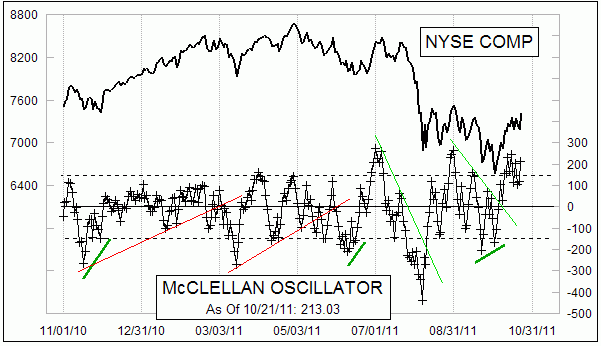
My chart this week is the same one that is featured every day on our Market Breadth Data page, and it is particularly noteworthy because of the multiple signs of confirmation that it is giving us about this new uptrend.
The first sign that something was brewing was the divergent higher low that the Oscillator made when the major stock market averages were making lower price lows on Oct. 3, 2011. Coming off of that divergent bottom, the Oscillator broke its own downtrend line, which is something that quite often precedes the breaking of the equivalent trend line drawn on prices. Trend lines like these on the Oscillator chart do not always appear, but when they do they are worth paying attention to.
The second sign of bullish power was that the Oscillator was able to rise up above +200 and stay there for a while. The Oscillator tends to shown an overbought condition up at around +150, but when it goes well above that level it shows that there is unusually strong liquidity.
The problem in making that interpretation is that a high Oscillator reading can also appear during snapback moves during a downtrend, as short covering leads a majority of issues to close higher for a few days. So this possibility should be kept in mind as technicians read all of the signs that the charts have to offer.
Here is an historical example of what I am talking about. During the 1998 double bottom, there was an initial Oscillator surge up to +230, which showed that there was some liquidity available to push prices higher. But that rally could not be sustained, and prices fell back down to make a double bottom at a much less negative Oscillator reading.
.gif)
Coming out of that double bottom, there was an even more powerful Oscillator surge, which said that there really was a lot of money wanting to get itself into the market. That is a condition which usually takes a long time to exhaust itself, and meanwhile prices trend higher as liquidity is gradually absorbed by the stock market.
Turning back to 2011 again, a third sign of bullish confirmation is that the Oscillator is forming a complex structure above zero. When we write about complex structures in the Oscillator, we are referring to choppy up and down movements without a crossing of the zero line. Complex structures imply strength for the side of zero on which they form, either bullish strength or bearish strength.
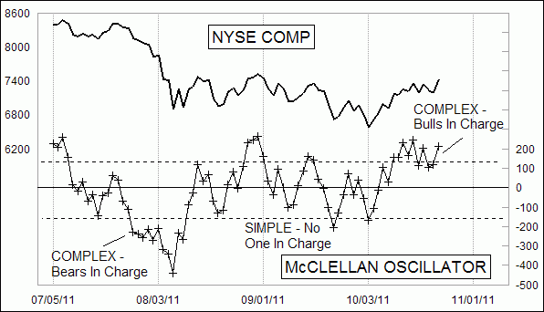
During the August 2011 decline, there was a complex Oscillator structure below zero, which told us that the bears were in charge. At the bottom on August 8, 2011, the McClellan Oscillator was at an all time record low, and so complex structure or not, it was time for a reflex rally. From mid-August through early October 2011, there were a series of simple structures above and below zero, which said that neither side was in charge.
At the right end of the chart, the complex structure with repeated surges to above +200 is saying that the bulls are in charge, and that they have some power. That is a condition that tends to last for a while.
Tom McClellan
Editor, The McClellan Market Report
Oct 14, 2011
The Key To Watch For In November |
Jul 08, 2011
Using the 10% Trend By Itself |
Mar 18, 2011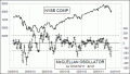
Oversold McClellan Oscillator |
Jan 28, 2011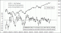
Common Only McClellan Oscillator |