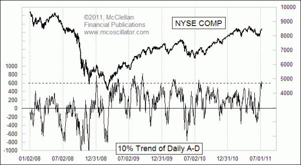
Using the 10% Trend By Itself
Free Chart In Focus email
Delivered to you every week
To calculate the McClellan Oscillator, we find the difference between two different moving averages. These are the 10% Trend and 5% Trend (19 and 39-day exponential moving averages) of the daily difference between Advances and Declines. A week ago, we saw the McClellan Oscillator get up to a really high reading of +275. That is a pretty high reading, which can indicate either strong upside initiation, or a really overbought situation in a snapback up move.
This week's chart looks at just one of the components of the McClellan Oscillator, the 10% Trend. It makes a good indicator all by itself, in addition to the way it is used in formulating the McClellan Oscillator.
The reason why we call it a 10% Trend instead of the now fashionable "19-day EMA" is that our terminology follows that of P.N. Haurlan, who first introduced the use of EMAs to track stock price data in the 1960s. He referred to them collectively as "trends", and differentiated them by identifying the smoothing constant used in the calculations.
The 10% Trend of A-D changes each day by 10% of the difference between the daily A-D number and the prior day's 10% Trend value. So to get it up to a high reading like what we see now in the chart, it takes a lot of days of strong positive market breadth.
The amplitudes of this indicator will be affected by both the number of issues traded on the NYSE, and the amount of market volatility. For the current era, readings above around +600 mark overbought conditions for the stock market. But the meaning of such an overbought condition can vary.
Sometimes a big overbought reading like this will occur as a strong new uptrend is being initiated. And sometimes it just marks a snapback up move within a downtrend. It is easy to tell which is which if you just wait a few months, but waiting for an answer does not do much good if one wants to know what is happening right now.
One key difference which shows up quite a bit in the historical data is that if an overbought condition comes with a higher high for the NYSE Composite Index, it tends to show strong upward initiation of a new uptrend. But if we do not see a higher price high along with the overbought reading, that can be a sign that it is just a snapback up move.
Coming up next week, we'll take a look at a little known breadth indicator, the Haurlan Index.
Tom McClellan
Editor, The McClellan Market Report
Jul 01, 2011
A Breadth Thrust Signal |
Jan 21, 2011
Why Even Fundamental Analysts Should Watch A-D Line |
Jun 18, 2010
All Time Record Low McClellan Oscillator |