New Highs’ Divergence
Free Chart In Focus email
Delivered to you every week
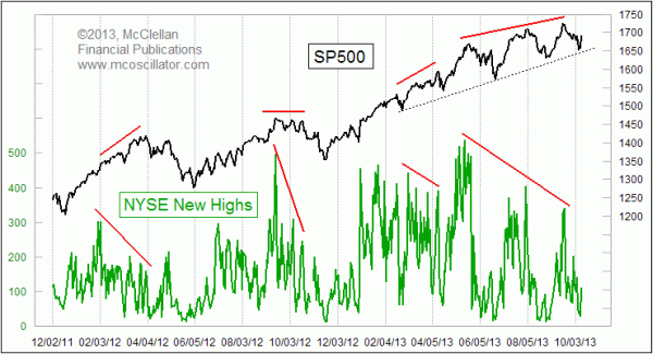
We are observing a huge divergence now between the daily number of new 52-week highs on the NYSE and what price indices like the SP500 are doing. In the past, divergences like this have been followed by more significant declines than what we have seen thus far.
The SP500 has declined 4.0% from the Sep. 18, 2013 high to its recent low, and all that this decline has done is to take the SP500 back down to test its rising bottoms line. That small magnitude of decline is not really what we have come to expect after seeing big divergences like the one that has unfolded during the summer of 2013.
A couple of other notable divergences are also shown in that chart above, and each led to a more significant price decline than we have seen thus far. But the apparent divergence in early 2013 was overcome by new highs surging ahead, and erasing the divergence. That has not happened yet in the current instance.
If we go back even farther in time, we can see some other good examples of how large divergences between price indices and the numbers of issues making 52-week new highs tend to lead to bigger declines than just a 4% dip.
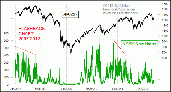
A long divergence played out during 2007, as each successively higher price high came with a diminishing number of issues making new highs. While some might think that is a good thing to have new stocks coming on to replace the tired leaders which led the first part of the advance, in practice the non-participation of the former leaders at the end of an advance has historically been a bad thing for the health of the market.
Another big divergence appeared in 2011, as QE2 was ending and the market told those who were watching these data that there were liquidity problems. The ending of QE2 just exacerbated those problems
This flashback chart also provides us with another important lesson. 2010 showed us that the absence of a divergence is not necessarily a guarantee that trouble will stay away. The "Flash Crash" in May 2010 came just a few days after a big multi-year spike high in the number of new 52-week highs. But while that decline in 2010 was a big one in percentage terms, it was a very brief one and the market got back to work on building the next up wave.
Coming back to the current timeframe: The magnitude of the divergence we are seeing now in the number of new highs suggest that the market is due for more than just a pullback to its uptrend line.
Tom McClellan
Editor, The McClellan Market Report
Oct 04, 2013
Summation Indices’ Messages |
Sep 10, 2013
Bond CEFs Still Say Liquidity is in Trouble |
Sep 28, 2012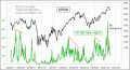
NYSE New Highs Data Say Uptrend Not Done Yet |