Small Cap Relative Strength

Free Chart In Focus email
Delivered to you every week
The Russell 2000 Index has had a good month so far in August 2014, rebounding more strongly than the NYSE-dominated indices. But that seeming strength just within August conceals what happened before in July 2014, when the Russell 2000 had a pretty bad month.
Comparing indices based on just a single month’s statistics can mislead investors and analysts. For that reason, some type of relative strength analysis is in order. One of the easiest ways is with a simple relative strength ratio.
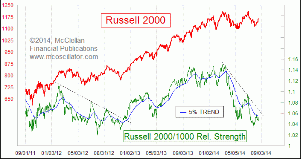
The ratio in the chart above is calculated simply by taking the daily closing value of the Russell 2000 Index, and dividing it by the Russell 1000. If the line moves upward, then the Russell 2000 is outperforming on a relative basis. That can mean going up faster, or going down more slowly. If the line is moving downward, then the small cap universe is generally doing worse than the large caps, on a relative basis.
In price terms the Russell 2000 Index seems to be making a nice, constructive high-level consolidation. But the relative strength line shows us that it has actually been losing ground ever since March 2014. 5 months of relative underperformance is a problem, and it is actually a sign of trouble for the overall market. This is because the small cap stocks tend to be more sensitive to overall market liquidity, either good or bad. When liquidity starts to dry up, such as when the Fed tries to wean the banking system off of QE, the little ones get hurt first.
But there is information in that pain. The breaking of trendlines on the relative strength ratio can precede the breaking of the equivalent lines on the price plot. And more importantly they can signal the change in the dominant trend direction.
Right now, the Russell 2000/1000 relative strength ratio is still in the downtrend that started back in March. The rebound that has taken the Nasdaq Comp and Nasdaq 100 indices to higher highs has not done the same for the Russell 2000, and the relative strength line has not yet even broken its declining tops line.
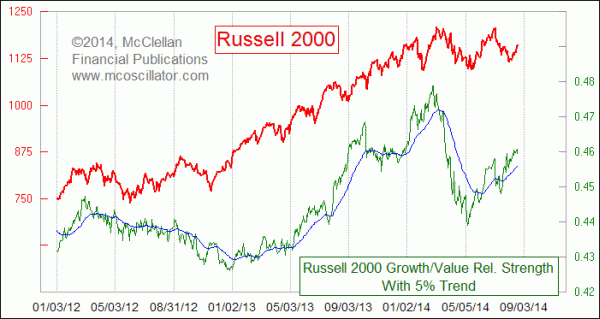
The same principle can also be applied to the Growth and Value subindices of either the Russell 2000 or 1000, or really to any pair of price series one wishes to examine. Whether a particular comparison can have meaning for you or about the market is something that has to be examined, but the principle is the same. Here is the Russell 2000 Growth versus 2000 Value relative strength ratio:

Small growth stocks took a bigger hit during the March to May 2014 selloff than other sectors. But they have also been bouncing back up more (relatively) since that May low, and not showing the same sort of weakness as the Russell 2000 vs. 1000 relative strength line.
Generally speaking, the overall market does the best when the Russell 2000 is leading, and when small cap growth stocks are doing the best. Right now, we do not have both conditions going for the market, which explains why the overall market is trendless since July. But when we get to the positive phase of the Presidential Cycle Pattern in about a month, all of the forces should start to align again for small cap outperformance, and thus for the overall market to do well again.
Tom McClellan
Editor, The McClellan Market Report
Apr 03, 2014
Bund Spread’s Message for the Stock Market |
Aug 07, 2013
Nasdaq A-D Line Does Not Work As Well |
Jul 06, 2012
Relative Strength Can Sometimes Be Too Much of a Good Thing |